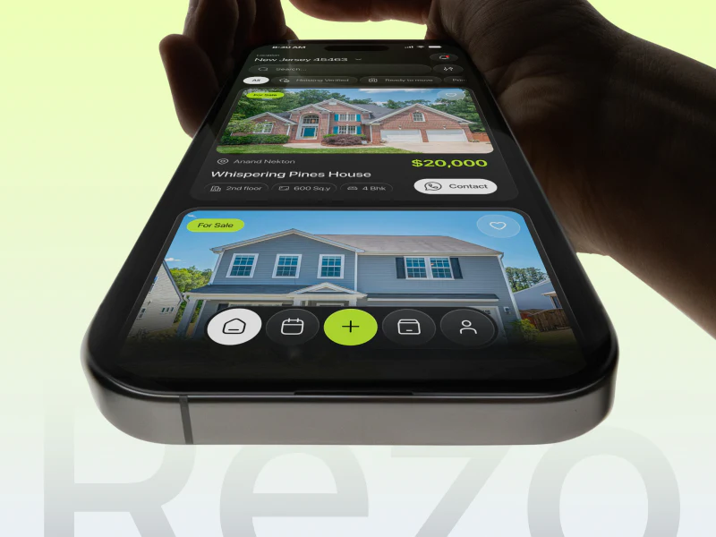
Rezo’s property app does not make everything bright. White highlights buying or renting, yellow-green marks prices and bottom actions, and other conditions sit in quieter dark groups. It offers a useful study of how transaction intent, property information and a next step remain findable amid substantial content.
Key takeaways
- Buying or renting comes first, defining the transaction before property conditions.
- Details separate price, three attributes and photographs, with information close to contacts.
- Brightness focuses on price and primary actions, with the same rules in smaller components.
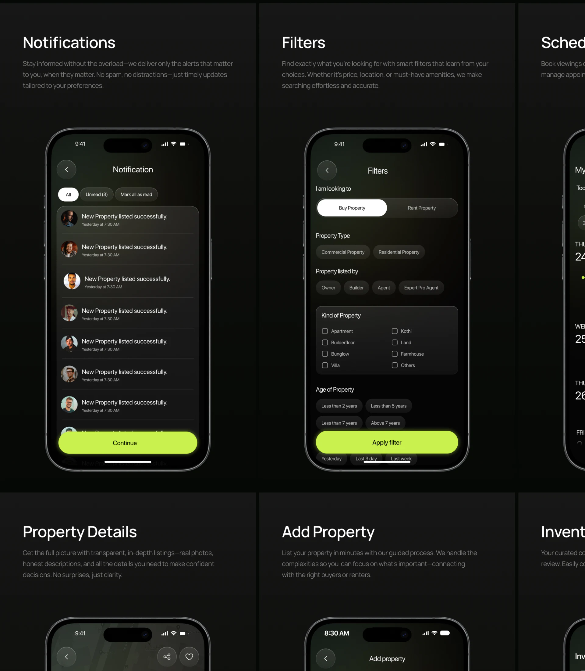
Filters first ask whether to buy or rent
Filters places long Buy Property and Rent Property switches below “I am looking to.” The selected option is white; the other stays dark. They precede every condition, defining the transaction before Commercial and Residential types.
Owner, Builder and Agent follow as publisher options. Property kinds have a separate rounded box with two-column checkboxes. Different controls and headings distinguish groups instead of making every condition an identical small tag, helping readers locate a category.
Property age sits below, with a bright yellow-green Apply filter at the bottom. JVDS considers one concentrated submit position easier to read than a prominent button for each group. Results should retain conditions, especially transaction mode and price units, so leaving filters does not restore uncertainty.
Price and attributes receive different emphasis
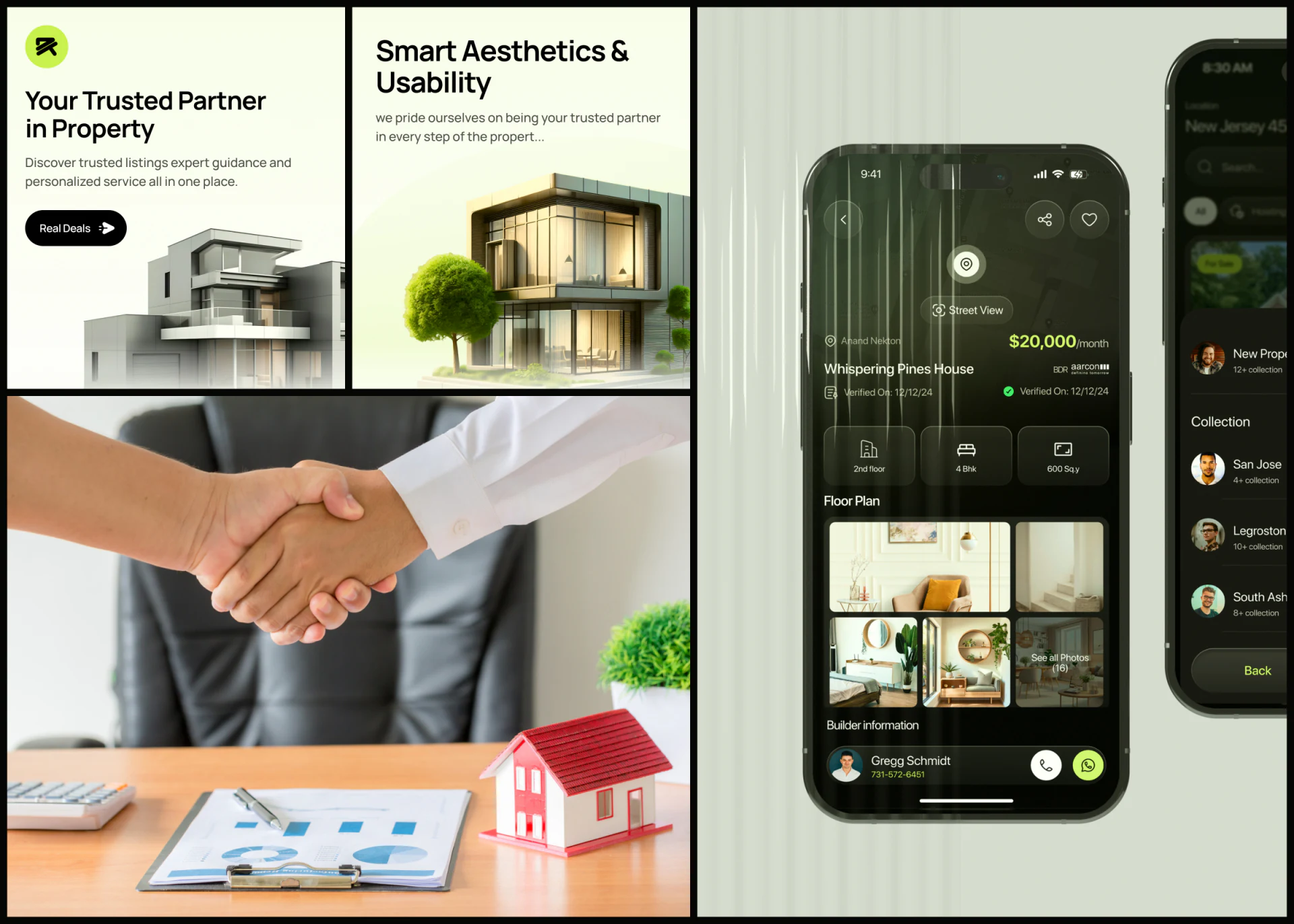
Yellow-green highlights monthly rent, with the property name below and three small cards for floor, layout and area. Price explains cost; attributes explain the home. Equal-width cards support scanning, while text beside icons avoids asking a bed symbol to explain the layout alone.
Verification wording and date share the area, but a bright tick only indicates a mark. A finished interface should state what was verified and when updated. Its position can be reviewed; it does not establish that the property’s current condition is verified.
Unequal photo tiles show several interior angles. Builder information below connects an avatar, name, telephone and chat. Information and communication remain close, making it useful to retain the property name and transaction mode before an inquiry.
Consistent components still need accurate content
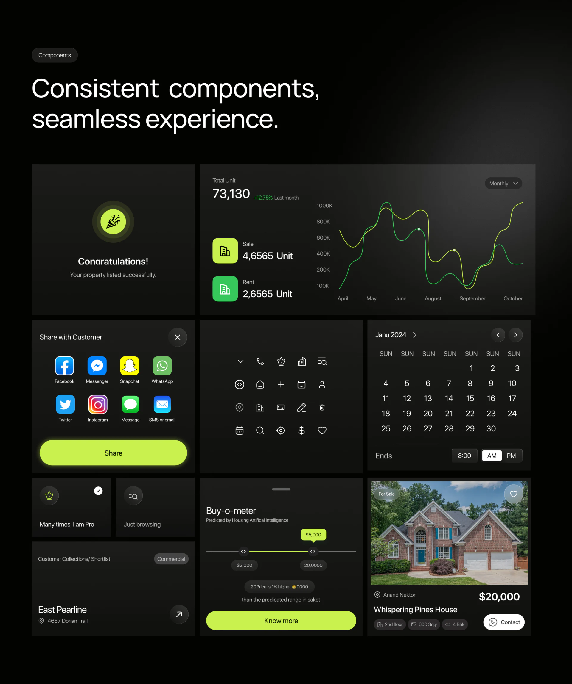
Share panels and price sliders use yellow-green buttons; property cards use white Contact. Dark backgrounds, rounded shapes and fine icons recur, preserving one visual language as content changes. This can help users recognize onward actions in complex property products.
Appearance cannot replace accurate headings. Floor Plan sits above interior photographs. If those are the only images, call them interior photographs and give plans a separate route. Accurate names distinguish evaluating decoration from understanding spatial arrangement.
Calendar weekday headings repeat SUN, while sale and rental displays use the same property name and similar amounts. Real content should check weekday order, transaction units and property identity before delivery, making polished components understandable in actual business.
Frequently asked questions
Why separate buying and renting first?
Transaction intent changes prices and communication. Putting it first defines scope; results and details should retain the same mode and units.
Do property details need photographs and plans?
They answer different questions. Photos show setting and decoration; plans show room relationships. Accurate headings should explain what is available when a type is missing.
Design review checklist
- Reconcile buying/renting and price units across filters, results and details.
- Read card text alone to identify floor, layout and area.
- Match each image heading to its actual content.
Many properties, but difficult pages?
Property platforms handle filters, photos, appointments and contacts together. First clarify conditions at each step, then arrange hierarchy and components. Bring property information and current pages to discuss the interface.
JVDS Design Studio provides UI/UX design, website design and development, helping organize interfaces, content and development requirements.
 Link copied