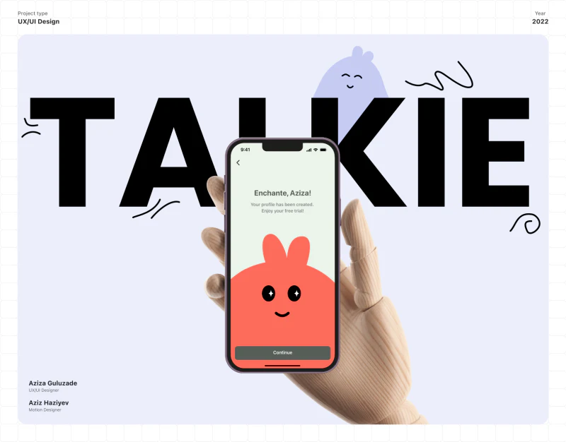
What makes Talkie’s language learning app design interesting is that the questions keep changing while the page rhythm stays familiar. Pale green backgrounds, coral options, and Continue at the bottom carry through from onboarding to practice, making the next step easy to locate.
Ask one thing, then offer a clear button
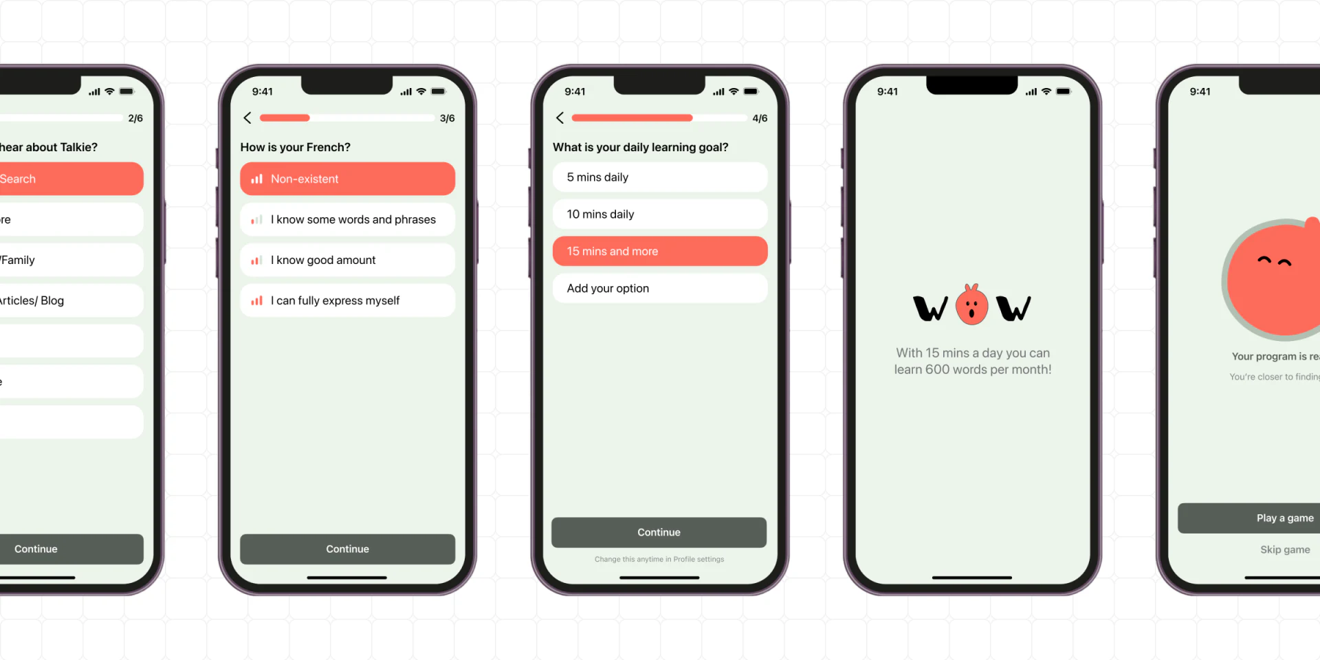
The level page describes speaking ability in a few short sentences rather than presenting technical proficiency levels immediately. Options run vertically, the selected one turns coral, and generous space remains below. This suits first-time use: understand the question, then compare answers, without also learning unfamiliar abbreviations.
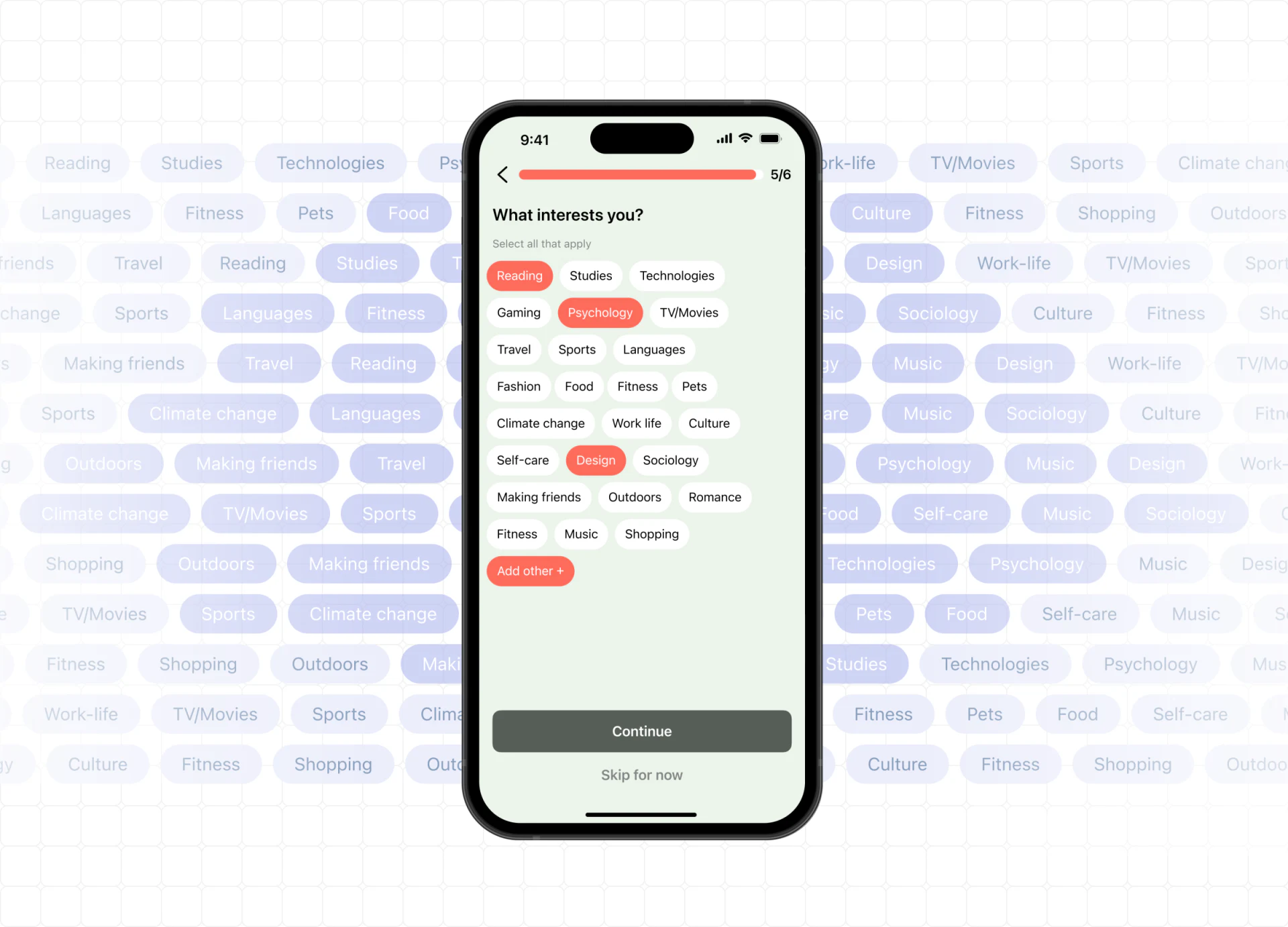
A step count sits beside the progress bar at the top, with a back arrow on the left. What to do on this page and how much remains appear in the same view. The daily goal page uses the same positions; the duration options change, but the way to act does not.
Below the continue button, the goal page says the choice can be changed in personal settings. This quiet sentence is valuable because it makes the daily goal feel adjustable. In a similar onboarding flow, explanations relevant to the current choice belong nearby, so people do not have to finish setup before searching a help page.
Interest tags leave room for uncertainty
The interest page marks selected tags such as Reading, Psychology, and Design in red; the others are white. They resemble small slips of paper, with widths following the text. Several rows feel lighter than making every option a full-width button. The multiple-selection note beneath the heading also explains why several tags can be red at once.
JVDS places particular value on Skip for now at the bottom. New users may not yet know which topics they want to discuss, and skipping prevents this question from blocking learning. A custom entry is on the same page, giving both existing categories and additional interests a place.
Fitness appears twice, and Add other uses the same red as selected tags. Further refinement could remove the duplicate category and give the add action a clearer style. The tags would retain their lively character while distinguishing “this is my interest” from “I want to add another interest.”
Four exercise formats share a structure
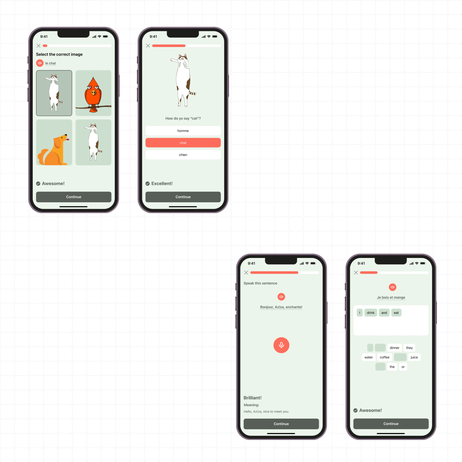
The image question uses four illustrations to identify animals, while the word-choice question arranges options vertically. The speaking question gives its center to a sentence and microphone. Sentence building places selected words in a white area, with available word tiles below. Different exercises use different response methods, which fits their content better than forcing them into identical cards.
These screens still retain progress at the top, with feedback and Continue near the bottom. The visual sequence—read the question, receive a response, then continue—is stable. In language practice feedback design, the task stages should be consistent while the question area can vary.
The speaking page adds the sentence meaning beneath positive feedback, offering more learning content than “well done” alone. Further review could check wrong answers, retries, and withdrawing word tiles along the same lines. Their availability and behavior after a click cannot be confirmed from these static images.
The animals in the image question sit in similar pale green squares, with a dark border around the selected cat. Red marks the pronunciation button, while a border marks the answer, so the two actions do not compete through identical styling. The adjacent cats look similar; a production question bank would need to check whether each image maps to a unique answer. Attractive feedback cannot replace that content review.
Selected sentence-building words run left to right in the white area, while their original positions among the candidates become pale placeholders. Space and placeholders communicate where the tiles have moved. An additional state showing a word returning to the candidate area would help designers and developers agree on undo behavior, rather than documenting only an attractive completed answer.
Keep characters lively and choices explainable
The pale green background softens the generous empty areas. Coral concentrates around options, pronunciation, and recording, while black illustration outlines add a playful note. Question text does not adopt the exaggerated character styling, giving the illustrations and instructional information their own voices.
The celebration page after goal selection describes a relationship between study time and vocabulary quantity. This can be examined as a copy layout, but not treated as an actual learning outcome. A comparable reward page would be better grounded by explaining which settings were completed and what practice comes next, so the encouragement has verifiable content.
Design review checklist
- Review onboarding pages in sequence to confirm consistent back, progress, and continue positions.
- Make adding an interest distinguishable from selecting one.
- Document wrong-answer and retry states for image and speaking questions.
Planning a learning product?
Course content, first-use settings, and practice feedback need to be reviewed together on actual screens. JVDS Design Studio provides UI/UX design, website design, and development services, and can help organize a learning product’s interface and introductory website.
 Link copied