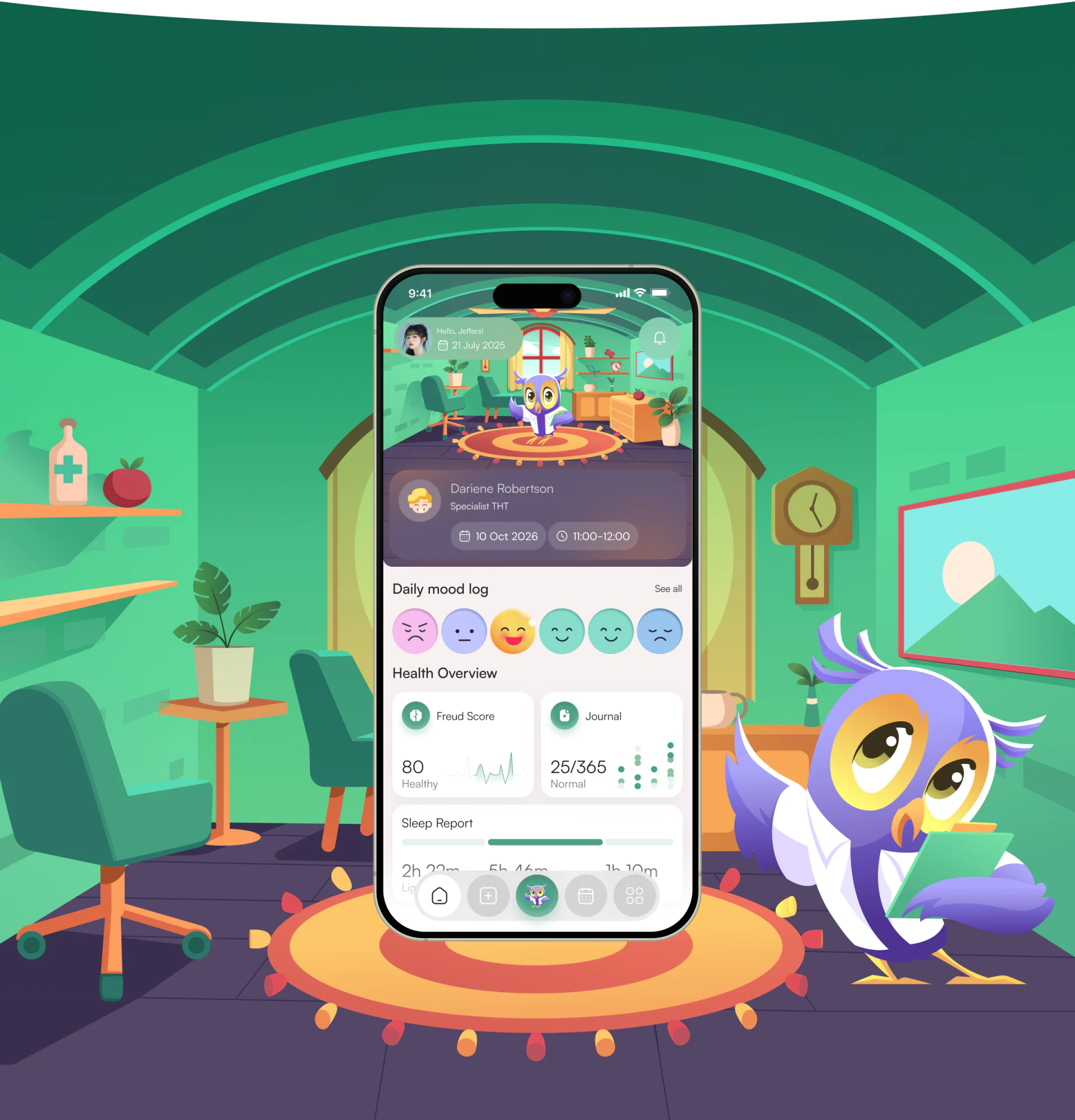
The charm of Carely’s mood logging app design begins just before you make an entry. An owl stands in a room with windows, plants and a rug; a row of expressions sits below. The scene invites a slower look, while the entry point for recording a mood stays easy to find.
Key takeaways
- Carely places its character in an everyday room, giving mood logging a friendly opening.
- The homepage moves from a colourful scene to white cards, keeping mood choices and recorded information clear.
- Short chat prompts offer a starting point, while free text leaves room for feelings that are harder to describe.
A small room gives the homepage an everyday feel
Much of the homepage’s warmth comes from ordinary objects. Two chairs sit by the window, a picture hangs on the wall, and a plant stands beside the cabinet. The owl occupies the centre of the rug like a resident of the room. There is plenty to look at, yet the recording page still feels like a working interface.
Look inside the phone screen: the avatar, greeting and date remain at the top left, followed by an appointment card below the scene. You can look at the character and still read information that concerns you. This is a useful detail when reviewing a mascot: place it inside an actual page and see how well it sits alongside the text.
The green room and purple character make a pleasing contrast. Purple continues into the appointment card, connecting the character’s colour to a functional area. For a similar interface, placing a real card within the illustration can reveal colour problems more readily than looking at character artwork on its own.
Further down, the colours become quieter
The homepage returns its denser information to a white background, and that restraint works well. The room occupies the upper area; by “Daily mood log”, the background has simplified and the row of round expressions is easy to spot. Scores, journal entries and sleep records each have their own cards further down.
At JVDS, we think this transition is worth studying. Furniture, a character and lighting already make the illustration busy. Small text would be harder to read if the data area carried the same complexity. The white background helps the eye shift from looking at a scene to finding information.
Two of the six expressions, however, are green smiling faces that look quite similar. They are appealing, but the image alone does not make their meanings clear. To refine this mood logging interface, we would first give those choices short names, then offer room to add a sentence after selecting one. The character of the icons can stay, with a clearer basis for choosing between them.
The useful detail in the chat page is its short prompts
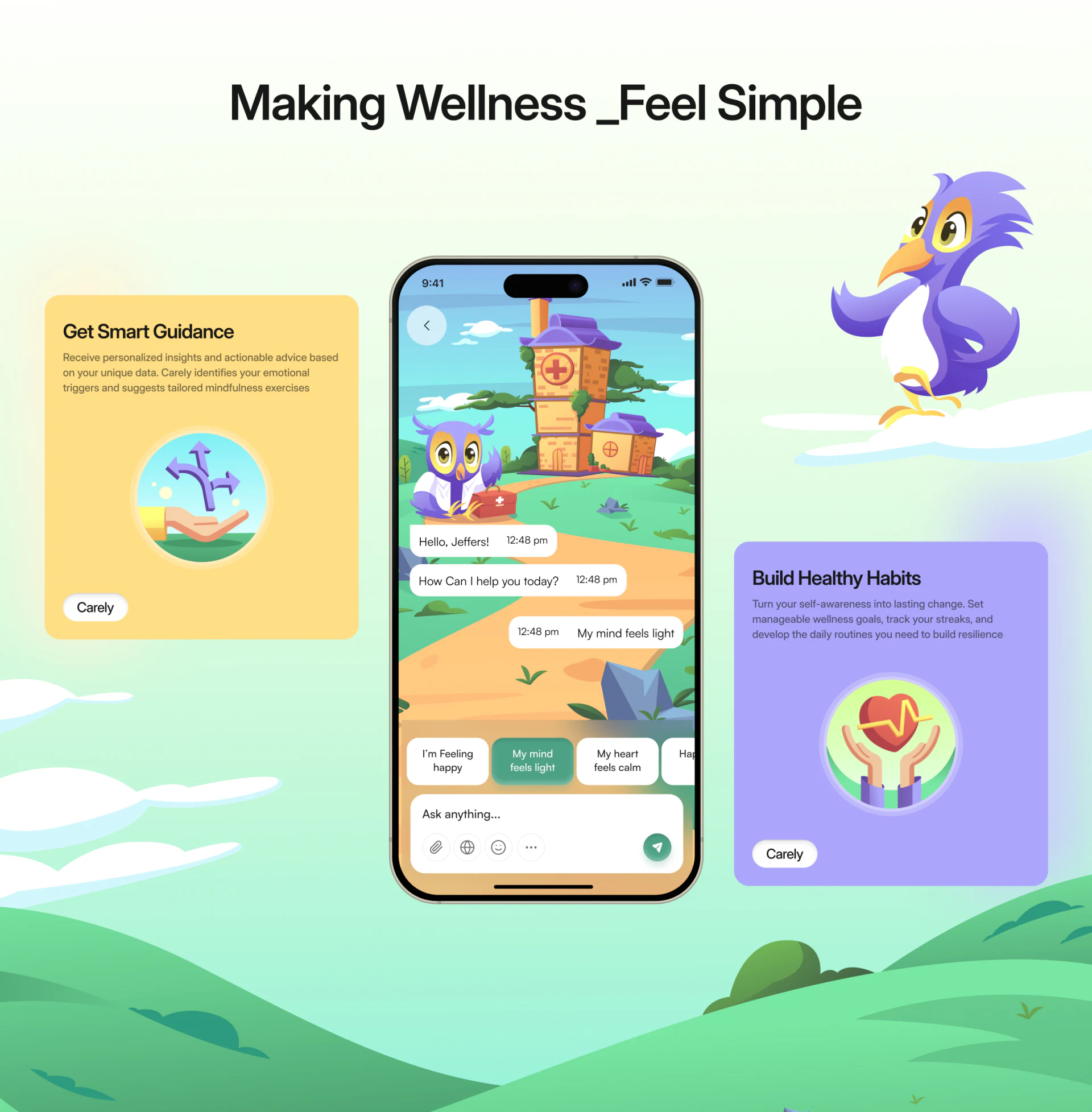
The few suggested phrases on the chat page are easy to overlook, but useful. “I’m Feeling happy” and “My mind feels light” sit above the input field, with “Ask anything...” and a send button below. The artwork is rich, while the place to start speaking remains clear.
In the image, “My mind feels light” is highlighted in green and also appears in the message bubble on the right. The screen gives a concrete example of a prompt becoming part of a conversation. If you only want to leave a note such as “I’m a little tired today” at the end of the evening, and none of the choices fits, the input field has a clear purpose.
From JVDS’s perspective, keeping prompts close to the input makes them easier to review together. Are the phrases too long? Is it easy to notice more items in the horizontal row? Does the input field stand out enough? Those questions become more useful when applied to a specific screen than a general call to make expression easier.
The static image does not show whether a selected phrase can be edited or when it is sent. Allowing an edit before the user confirms sending would give more control over the wording. The position of the latest message and send button also deserves a separate check when the keyboard opens.
The product website carries the same visual language
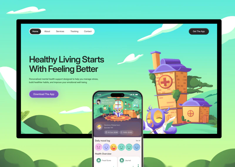
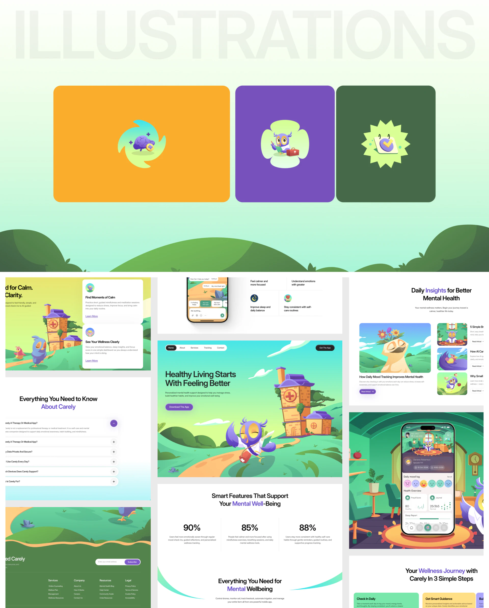
The introductory website continues the app’s house, owl and green landscape, with purple emphasis on download buttons and some text. Moving from the website to the phone interface, it is easy to recognise the same product.
Feature cards, article covers and the question area each have a place in this visual system. The white feature cards are especially useful: they preserve the illustrated atmosphere while giving explanatory text a quiet background. For health app interface design, this offers an approach worth considering—carry the brand imagery through, while keeping the product explanation readable.
Frequently asked questions
Do large illustrations suit a mood logging app?
They can suit pages centred on companionship and everyday recording, provided that input and review have clear places. Carely puts its room near the top and gives the recording area a white background; a similar layout still needs checking on a smaller screen to see how soon the entry point appears.
Are expressions alone enough to record a mood?
Expressions are useful for a quick choice, while more complex feelings also need space for words. Similar icons benefit from distinct names and a way to revise the choice just made.
How can an app and its product website feel consistent?
Continue the character, main colours and illustration style, then arrange text around each page’s task. Carely repeats the house and owl on its website and uses white feature cards to explain the product, making it a useful example of that combination.
Design review checklist
- Place the character beside real interface cards and check that the text remains readable.
- Find the mood logging entry point on a smaller phone screen.
- Explain each expression and add names to choices that are hard to distinguish.
- Select a chat prompt, then open the keyboard to check the editing and sending positions.
Planning a similar app or product website?
If you are planning a health management or mood logging app, or a website that shares your product’s visual style, bring your ideas, existing screens or design references to the conversation.
JVDS Design Studio provides UI/UX design, website design and development. We can help you work through the interface, content and development requirements.
 Link copied