Images become distorted after a responsive website update: which settings should operators check?
If replacing an image on a responsive website causes distortion, distinguish source proportions, page cropping, and insertion settings first, then choose a correction according to the image's purpose. This helps responsive website operators. Product details and decorative images need different assessment criteria; stretching or forced cropping should not be used indiscriminately to fill an area.
First distinguish distortion from cropping
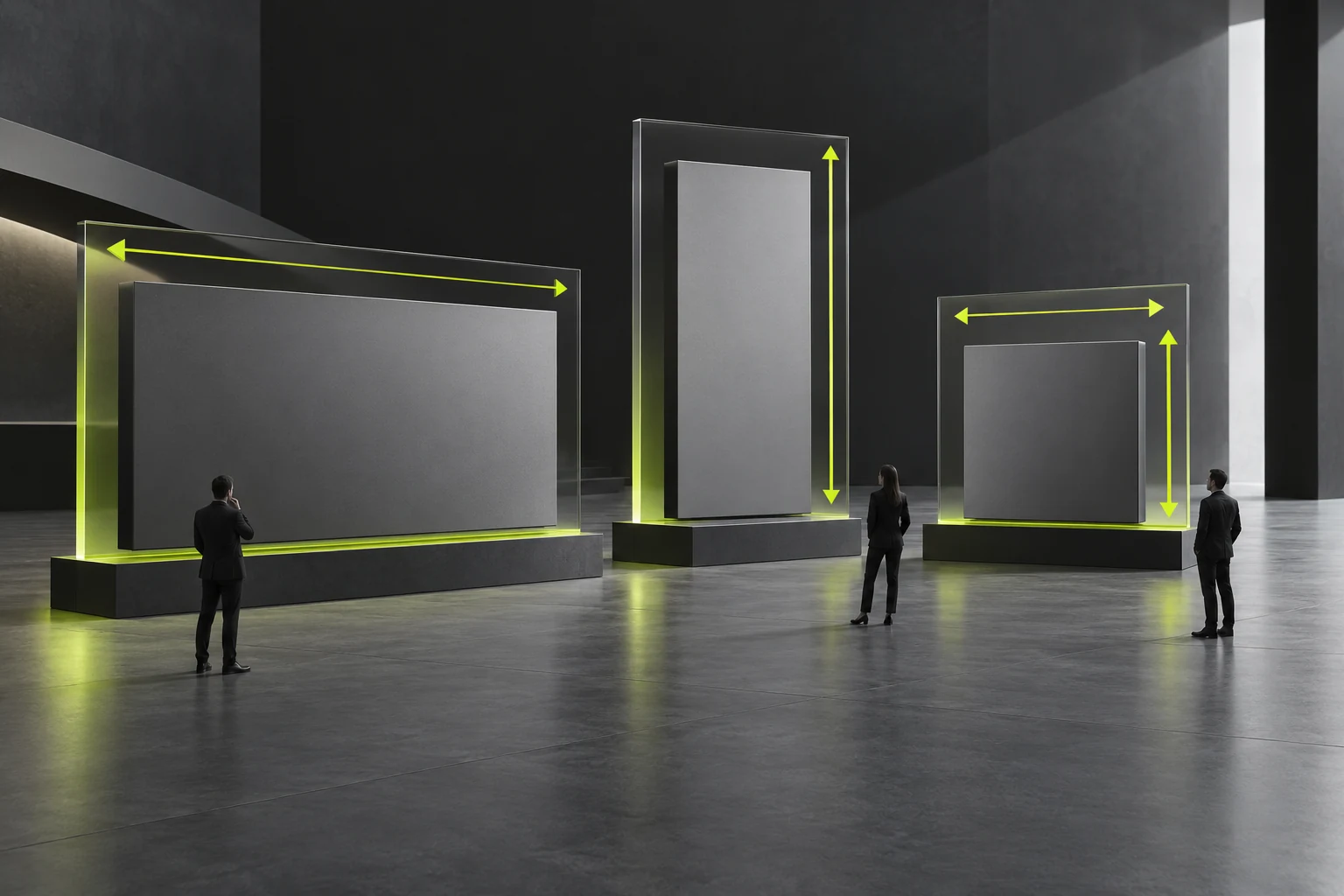
Compare the source file with the web display. Changed object proportions may indicate unsuitable width and height settings. Preserved proportions with missing edges usually require checking crop rules. Blur requires checking source quality and display size too. Calling every symptom ‘the image is wrong’ makes the appropriate action difficult to identify.
Confirm the original image is not itself distorted, then inspect desktop and mobile display. If only one layout has the problem, record the page, content position, and observation conditions for the responsible person. Do not immediately replace site-wide styles; a local content issue may not need a software change.
The image's purpose determines permitted treatment
Decorative backgrounds often allow cropping around the subject, provided important visual content remains. Product images, structural diagrams, and operating illustrations may not allow arbitrary removal of edges. Cropped annotations, connections, or dimensions alter understanding; use full display or a clear way to inspect the whole image.
Suppose a homepage portrait shows only its center on mobile. A person near the edge may disappear. Replace it with a suitably composed licensed photograph or adjust its focus using supported system controls. Confirm focus editing in the actual CMS.
An image containing substantial text may become unreadable when reduced on mobile. Consider converting key information into web text while retaining the image for explanation. The company still reviews specifications and business facts; operators should not redraw or rewrite specialist material merely for responsive display. See How to Make Web Images Responsive: Stop Loading a 3000px Image on Mobile for related checks.
Check three administration locations
First, check upload: the correct image field and any proportion or purpose guidance. Second, check the editor: manually imposed fixed dimensions or an incorrect insertion method. Third, check the template: whether cropping or full display was agreed. Actual system capabilities determine how much administrators can adjust.
Before changing anything, save the original and current settings, and check with test content or previews. Correct insertion-setting issues within agreed permissions. For template-rule problems, provide a sample to designers and developers. Do not repeatedly try different pictures without recording the symptoms.
When discussing corporate website design and administration delivery with JVDS Design Studio, request clear purposes and examples for image locations and confirm the limits of replacing images. Responsive and CMS functions follow project agreements; operating tips do not promise automatic correction of every image.

Accept corrections based on content completeness
Check subject proportions, important details, text readability, and empty space on desktop, mobile, and relevant intermediate widths. Filling an area does not necessarily pass; missing critical details still require correction. Have the material owner verify that processing product diagrams has not changed their meaning.
Success means the image's purpose is preserved, information is complete, and operators can make later replacements using the rules. Record recommended asset conditions and prohibited actions for other editors. If a category repeatedly exceeds the rules, the template may need adjustment rather than continual manual remedies. See How to optimize the images on the corporate website? It's not the case that the smaller the pressure, the better: clarity, loading speed, SEO and accessibility should all be addressed simultaneously for related checks.
Frequently asked questions
Is making every image the same proportion easier?
Uniform proportions suit images only when their purposes and placement rules match. A product diagram and homepage background may have different needs. Distinguish their purposes before setting upload guidelines, so necessary information is not cropped away.
Does a mobile image pass if it is undistorted but the subject is missing?
No. If the subject explains something, adjust cropping, composition, or display so readers can understand it. Decorative images still need to support brand expression. Checking width-to-height ratios alone is insufficient.
Need design or website development services?
JVDS Design Studio is a professional design studio focused on digital product experiences and brand identity. We work with businesses in China and overseas that want to strengthen their brand image, improve user experience and grow their business, providing clear, usable UI/UX design, high-quality website design and development, app and mini-program development, and cohesive, distinctive brand identity design.
Planning a corporate website, a multilingual site or a redesign? Tell us about your audience, existing website and the work you need.
 Link copied