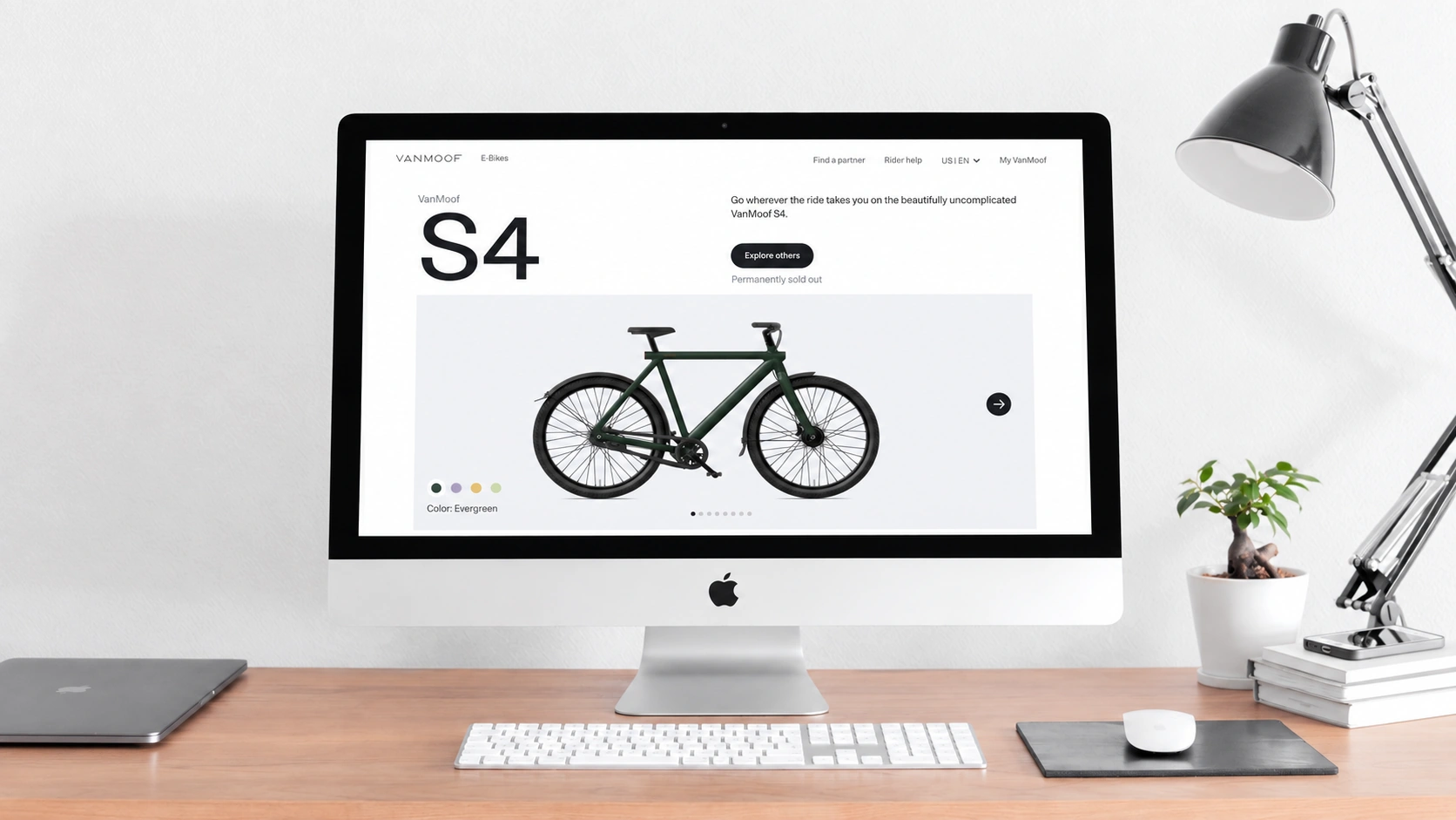
Building a website is a complex process; applying a template alone is not enough. A personalized corporate website requires careful attention to aesthetics, comfort, and functionality. These factors should be considered together through sound planning and design before development begins. InBeijing website development, the background color directly affects users' visual perception, so the website's style and color palette need to work together. The following points explain how to choose a more effective background color.
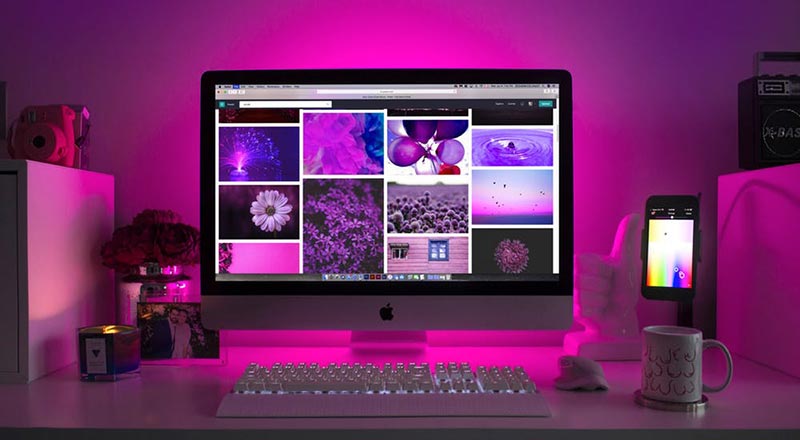
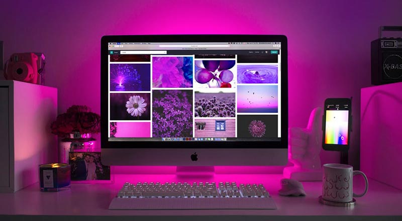
A homepage background should not be selected blindly. It needs to align with the site's overall style. A technology website, for example, may use restrained, stable colors such as white, gray, or black. A business website seeking a composed, substantial image might choose black, gray, dark navy, or white. A playful style may favor softer pastel colors. It is generally advisable to make one tone dominant across the site, although a designer who can successfully create a concept such as “colorful black” may also make that approach work.
A well-coordinated background is important because a full website combines many elements, including images and text. Beyond the background itself, the colors across the page also need careful coordination. Colors from the same family are generally more harmonious than combinations with excessive contrast or poor compatibility. A simple, related palette can make the website feel more refined and minimal while providing a more comfortable visual experience.
Background color influences how comfortable users feel while browsing. The page background, typography, and other interface colors should therefore be coordinated with one another and with the site's primary style. A rational palette can give the finished website a more refined, high-quality appearance and support a stronger user experience.
Need design or website development services?
JVDS Design Studio is a professional design studio focused on digital product experiences and brand identity. We work with businesses in China and overseas that want to strengthen their brand image, improve user experience and grow their business, providing clear, usable UI/UX design, high-quality website design and development, app and mini-program development, and cohesive, distinctive brand identity design.
Planning a corporate website, a multilingual site or a redesign? Tell us about your audience, existing website and the work you need.
 Link copied