How Should Complex Product Demo Materials Separate an Overview from Task Details for Mobile Viewing?
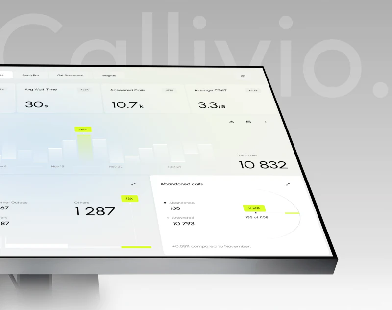
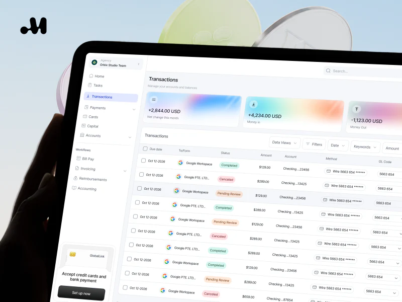
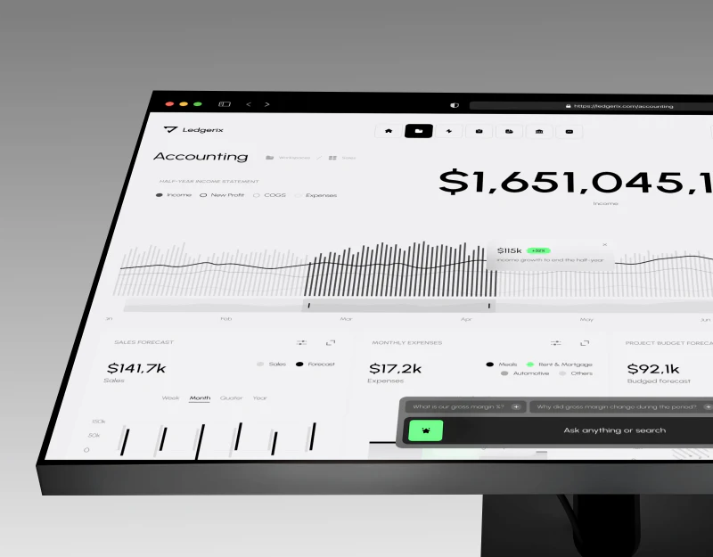
Complex software screenshots contain navigation, lists, fields and messages. When the whole image is shrunk onto a phone, readers may not even recognize the current task. Exporting a higher-resolution file adds details that can be enlarged, but does not change information density during normal viewing. If customers need to understand the product before deciding to watch a demo, materials should serve different levels of reading.
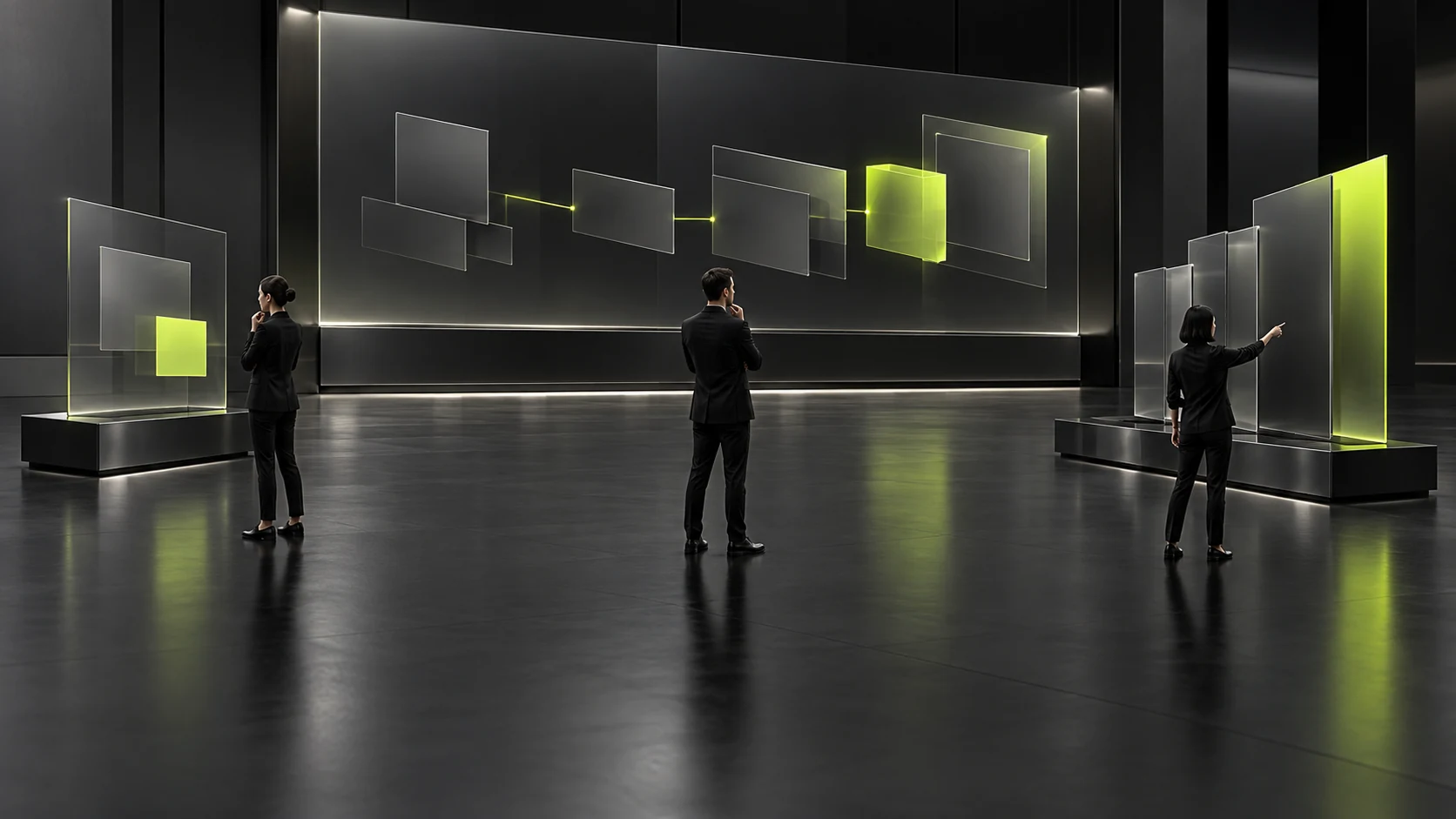
Product demo materials can be divided into an overview, task details and the complete process. Mobile previews help identify the subject, projection helps several people build shared understanding, and operating demonstrations show actions and outcomes. All three concern the same product and task, but need not use the same reduced screenshot or alter actual functions and statuses for visual appeal.
First identify where the materials will be viewed
Collect the actual settings for this use: forwarding on phones, reading before the meeting, meeting projection or live operation. For each setting, ask what readers need to judge at that moment. A phone preview may need only to identify the product and task. Projection needs clear points for explanation, while live operation requires the complete path and feedback.
Do not equate the viewing device with the device used to operate the product. A customer reading a desktop software introduction on a phone does not mean that the software supports the same actions on mobile. Explain which product environment the materials show, so a phone mockup does not imply unconfirmed mobile functions.
Consider this hypothetical situation: a company introduces a task management product to purchasers and users, first sending a short preview, then explaining it through projection, and finally showing operations. It describes neither a real customer nor actual product results. The three sets of materials should answer their own questions rather than placing the same long image into three different containers.
Retain versions and statuses when organizing assets. An overview from one version and close-ups from another may lead readers to think they can find everything within the same process. Describe existing functions, samples and directions requiring evaluation according to their actual statuses rather than omitting those facts because the materials are promotional.
Also check whether readers can open subsequent content themselves. A host can explain during projection, but nobody is present after materials are forwarded. Versions intended for independent reading need necessary context without relying on spoken explanations from the meeting. Arrange dimensions and layout after establishing each material's task.

Use the overview to establish position rather than explain every field
An overview can use a few modules to explain the product's main components, the current task's position and the expected outcome. Select information useful for understanding rather than including every feature name. The overview has served its main purpose when readers can state which part of a task they are about to see.
A complete screenshot may serve as a background or help recognition, but important explanations need to appear as normally readable content. If readers must zoom in to identify the subject, the overview still carries too much detail. Organize the task name, object and brief explanation separately rather than embedding everything in one dense image.
Simplification must not add structures absent from the actual product. When reorganizing several modules into an introduction graphic, identify it as an explanatory overview rather than pretending it is the real interface. Customers need to distinguish product screens from content organization so they can judge on the correct basis.
The overview also needs to point toward task details. Use accurate material titles or verified entry points so readers can continue to the parts that interest them. Merely saying view everything leaves customers unsure whether a long image, video or operating environment will open. Describe the subsequent format according to the actual content.
To check whether the overview is concise enough, ask someone uninvolved in its production to read it briefly, then state its subject and what they would like to view next. If they remember only the product name and attractive colored blocks but not task relationships, add information. If they spend their time reading dozens of fields, reduce competition between levels of information.
Close-up screens need to retain the context before and after an action
Explain task details around inputs, actions and outcomes rather than cropping only a button. Close-ups can enlarge current information, but retain clues about the product, task and role so readers know which path it belongs to. Otherwise, greater detail may make the image harder to connect with the whole.
Each key screen can have a brief explanation of why the user arrives there, what they need to do, and what appears afterward. Base it on current functions or explicitly identified samples, without inventing automated processing or system results. Where particular operations have not been shown, keep them identified as unverified.
Before cropping, confirm which context cannot be removed. If a role affects available actions or the status of information affects later judgment, retaining only an input box is insufficient. Task needs should determine the crop boundary, rather than cutting screens into attractive sections of equal height. On-screen information and written explanations can complement each other.
A close-up is useful for exploring one key judgment and need not explain every field. Other details can appear in the complete process or current documentation, preventing each image from becoming a small manual. A clear focus also makes the explanation sequence easier to maintain during projection.
All fragments need to come from the same confirmed source, with the original assets still locatable. After a version change, check close-up explanations and the overview together rather than replacing only the most conspicuous image. Maintainers should know which task each fragment serves so it is not mixed with unrelated materials later.
The complete process should let readers return to the context
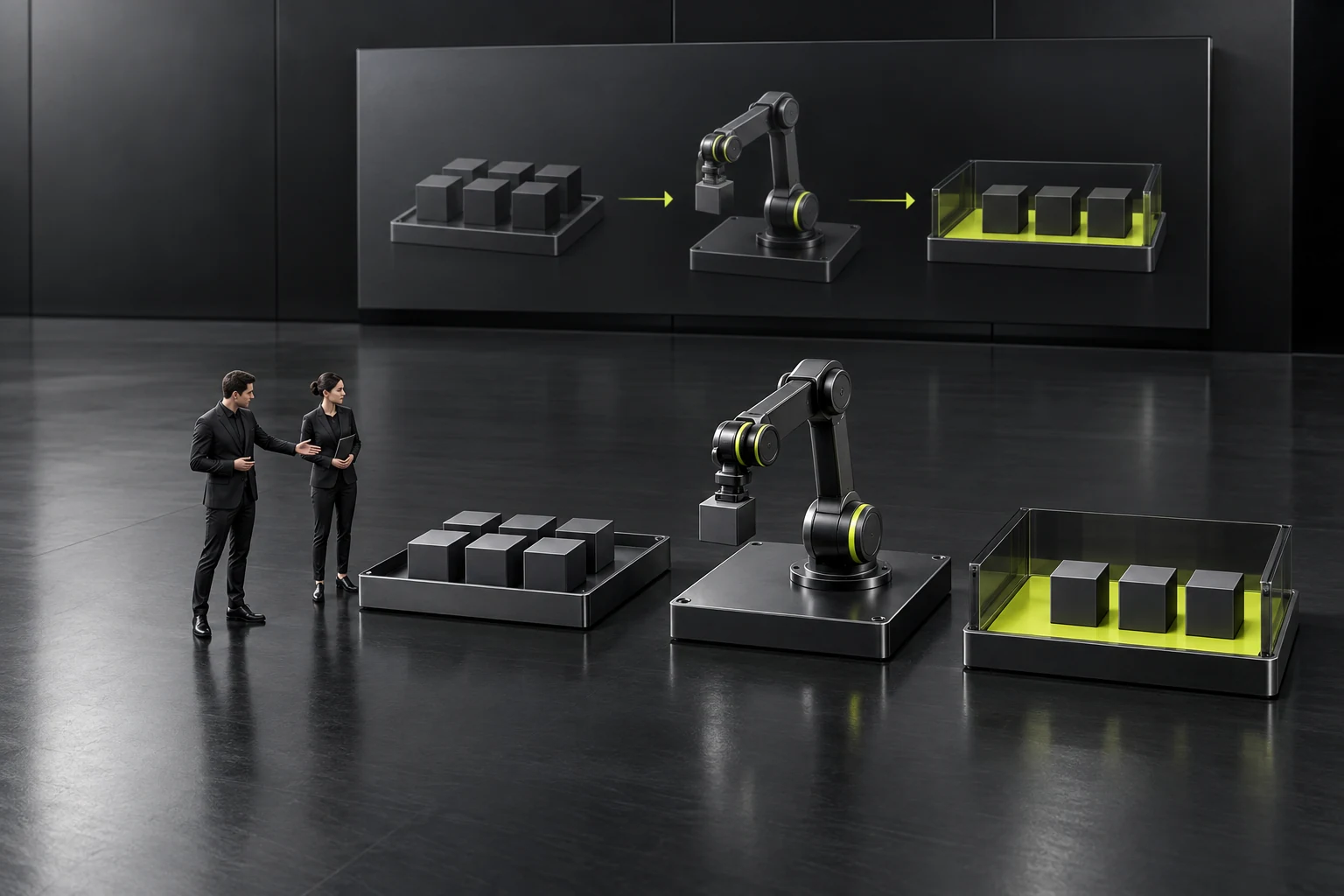
The complete process retains inputs, key branches, roles and outcomes for people who need greater depth. It need not be read immediately by everyone viewing a mobile preview. Provide it through task materials, explanations organized into sections or an actual demonstration, choosing the format according to current capabilities and material volume rather than assuming a new tool must be developed.
Readers moving from a close-up into complete content should know their position. For a long video, provide actually available descriptions of task sections. For a document, align titles and sections. For an operating environment, explain the current demo scope. Do not describe unverified navigation capabilities as already existing.
The return to the overview should also be clear. After studying one detail, customers may want to choose another task and should not be left with only an unexplained link to a large image. The materials can be simple as long as product identity, task relationships and the return direction remain identifiable. Complex animation is not needed to cover a navigation problem.
Complete content is not necessarily official operating guidance either. A sample process explains only its corresponding scope, while the product owner still needs to confirm the conditions applying to actual functions. Long content and detailed screens do not establish all product capabilities or prove implementation.
Retain version and source clues in downloaded and forwarded content. Readers viewing it offline or in other software should still be able to check its identity. A web link makes further reading convenient but cannot replace the task and status information necessary within the file.
Check the sequence under actual viewing conditions
When checking a mobile preview, view the subject, focus and material entry points in the normal reading mode rather than zooming in first and declaring the image clear. For projection, check from the actual viewing distance whether participants can recognize the object being explained. Judge font sizes and layouts according to real conditions rather than applying one fixed size as the standard for every setting.
Then follow the planned sequence from overview to close-up to complete content. Do readers know what opens each time, and can they explain how the current task relates to the preceding section? If they forget the product identity as soon as a detail opens, adding context is more useful than continually producing higher-resolution versions.
Check whether spoken explanations and materials agree. A host explaining the new version while the projected close-up remains old creates conflicting understanding. After updating materials, synchronize frequently used sending locations. Do not claim every historical copy has been replaced when those copies are beyond control; describe the update scope according to actual arrangements.
Ask content, product and design roles to confirm separately. The content owner checks whether information is understandable, the product owner checks facts and statuses, and designers check clarity and hierarchy. Passing one check does not establish that the others pass too. Visual attractiveness alone is insufficient for acceptance.
The work is complete when mobile readers can identify the subject, a projected audience can follow the key task, and readers seeking depth can view the full process and return to context. Allocating materials according to reading purposes prevents a complex product introduction from becoming repeated attempts to enlarge screenshots.
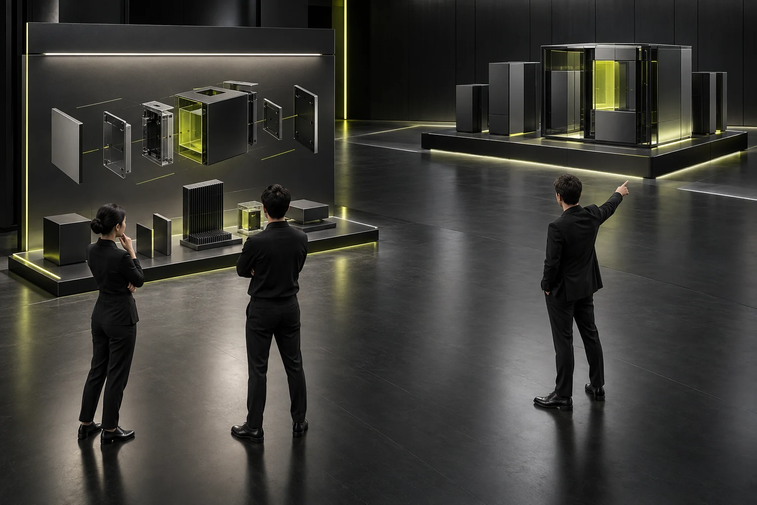
Also record which materials can be sent independently and which require accompanying explanations. Once senders know the difference, they will not forward a close-up relying on spoken background as a complete introduction. Clear material identities also reduce the need to explain the entire task again when adding information later. See Low-Fidelity, High-Fidelity, or Interactive Prototypes? Choose by Validation Goal for related checks.
Frequently asked questions
Is one complete PDF sufficient?
It can be, if the actual task is simple and readable. Complex materials usually need a clear overview and task index rather than expecting everyone to read from the beginning. Decide whether to divide the content based on actual reading checks.
Can a mobile preview contain only a few attractive screenshots?
It also needs the subject and task clues. Attractive screens can support recognition, but customers should not finish without knowing which function is being introduced or which materials to view next. The images must not imply unconfirmed mobile capabilities. See Responsive UI Design: From Breakpoints to Content Priority for related checks.
Is a larger close-up always better?
No. The focus needs to be clear without losing context. Enlarging only a button may conceal the action's purpose. Retain the necessary object and its preceding and following relationships, and place other details in appropriate materials.
Can redrawing an overview alter product facts?
It can, so identify its explanatory purpose and check the source. Expression may be reorganized, but product structures, functions and statuses cannot be added. An overview graphic should not impersonate a real operable interface.
If the live demonstration is clear, why check the forwarded version?
Forwarded materials lack the host's explanation and must stand on their own. Necessary information such as versions, tasks and statuses needs to remain identifiable. Successful live viewing cannot replace a check of later reading.
 Link copied