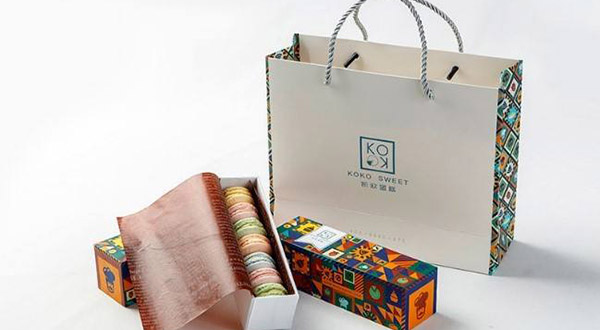
Product brand packaging strategy primarily includes two parts: presentation method and imagery. Professionals who study planning may understand these areas well, but to an ordinary client they can appear highly technical.
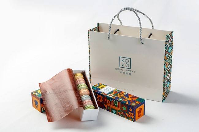
When people first hear these terms, they may find them difficult to visualize. How can they create a strong result? What kind of image should be selected to make the packaging stand out? These are the two topics discussed here.
The first important aspect of brand packaging planning is the imagery used on the package. Designers generally plan the composition and layout with care. A visual can feel expansive and impressive, refined and precise, or engaging to a particular consumer group. Packaging graphics may be presented realistically or produced through other creative techniques.
If no suitable image comes to mind, the design does not necessarily need a literal picture. Color blocks or a color-led composition can be used instead. These colors should be treated carefully and distributed logically so the final typography and layout feel coherent.
The second important aspect is the method of presenting the outer package. This depends on specific product characteristics, including function, standards, meaning, and cultural qualities. Integrating these elements into the packaging can create a distinctive, fresh, and unified impression.
These are the two principal aspects of product brand packaging strategy. They are easy to describe in brief, but designers may not always handle both accurately in practice.
This is especially true for designers who are just starting out. If they do not yet understand these areas well, their work may lack a distinctive character. Experienced designers who handle both aspects precisely are more likely to produce packaging that audiences accept and find satisfying.
Need design or website development services?
JVDS Design Studio is a professional design studio focused on digital product experiences and brand identity. We work with businesses in China and overseas that want to strengthen their brand image, improve user experience and grow their business, providing clear, usable UI/UX design, high-quality website design and development, app and mini-program development, and cohesive, distinctive brand identity design.
Updating your brand identity or website? Tell us where the design will be used and which materials you need.
 Link copied