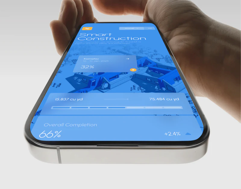
Tectra’s construction management SaaS UI places a building cutaway at the center of the workspace. Dots and progress overlays sit inside the blue model; cross-sections and metric cards continue in white areas. Finding a location before reading its values is the clearest direction in these images.
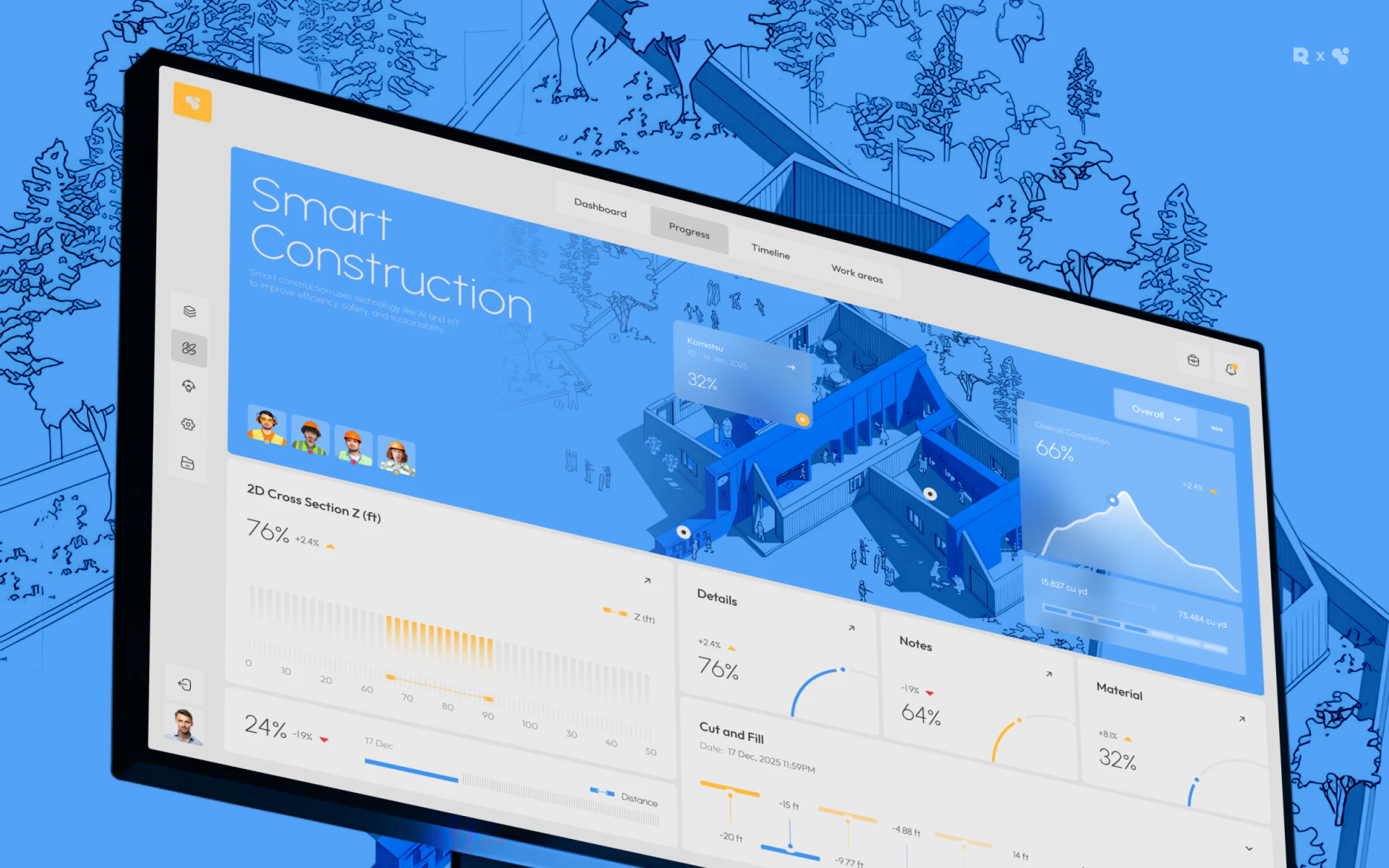
The blue model gives data a recognizable location
The building opens into a cutaway, retaining outlines of rooms, people and trees. Dots appear inside it, with a named, dated percentage overlay near one. Engineering data are associated with a place rather than hanging independently in a corner.
An overall completion card sits to the model’s right, distinct from local cards. Dashboard, Progress, Timeline and Work areas have separate positions at the top; pale gray marks the current view. Layout alone distinguishes spatial, statistical and work views.
JVDS appreciates the blue-yellow relationship. Broad blue unifies the model, while yellow is limited to markers, change arrows and local chart lines. A small emphasis color identifies a focus without turning every room into an alert.
Avatars at the lower left add personnel cues alongside spatial content without occupying progress-card headings. They remain visually separate from construction objects. If they represent participants, names and roles can clarify them in interaction; the illustrated avatars do not establish actual collaboration permissions.
The overall card’s curve differs from small arcs below: one emphasizes continuous change, the other a current proportion. Shared color does not erase chart roles. Review whether each engineering chart shows a trend, range or state before giving it equal visual space.
White areas change the reading mode
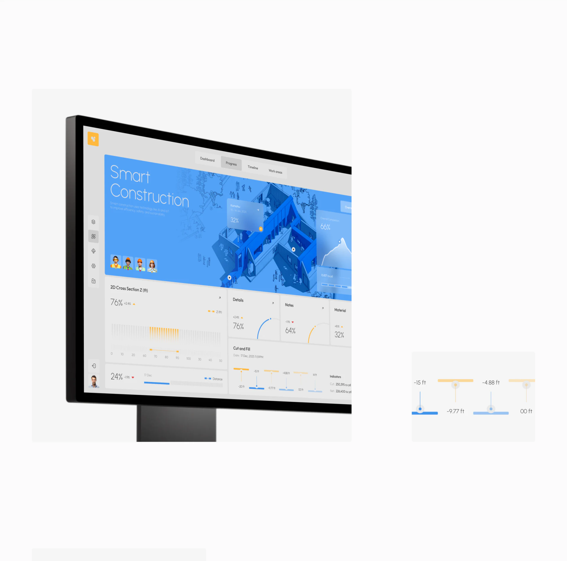
Details, Notes and Material cards below the model share large values and arcs. The blue scene contains many outlines, while white cards give numbers a quiet reading area. This helps dense software; the model need not carry every explanation.
Consistent cards make meaning more important. A percentage beside Notes still needs to explain whether it represents recording completion or another statistic. In JVDS’s view, names and calculation scopes belong near values; matching arcs do not make percentages comparable.
Small arrows at the upper right of cards suggest detail routes. A prototype can check whether the object name continues into details and whether an update date appears. These images show an entry point, not what it opens.
Small cross-section units explain the graphics
2D Cross Section Z includes ft in its title. Dense vertical lines contain a yellow section, with another blue range below. Color identifies intervals and wording explains the measurement; they have a visible relationship within one module.
Cut and Fill puts a yellow endpoint above and a blue endpoint below, with values close to their respective segments. This is more direct than an isolated row of numbers: the eye can compare positions. Space remains between short lines and small text.
These diagrams illustrate measurement presentation, not engineering accuracy. A working page should give endpoint names, reference baselines and periods. Thin pale-gray units particularly need checking at normal display size.
Mobile separates the spatial overview from metric lists
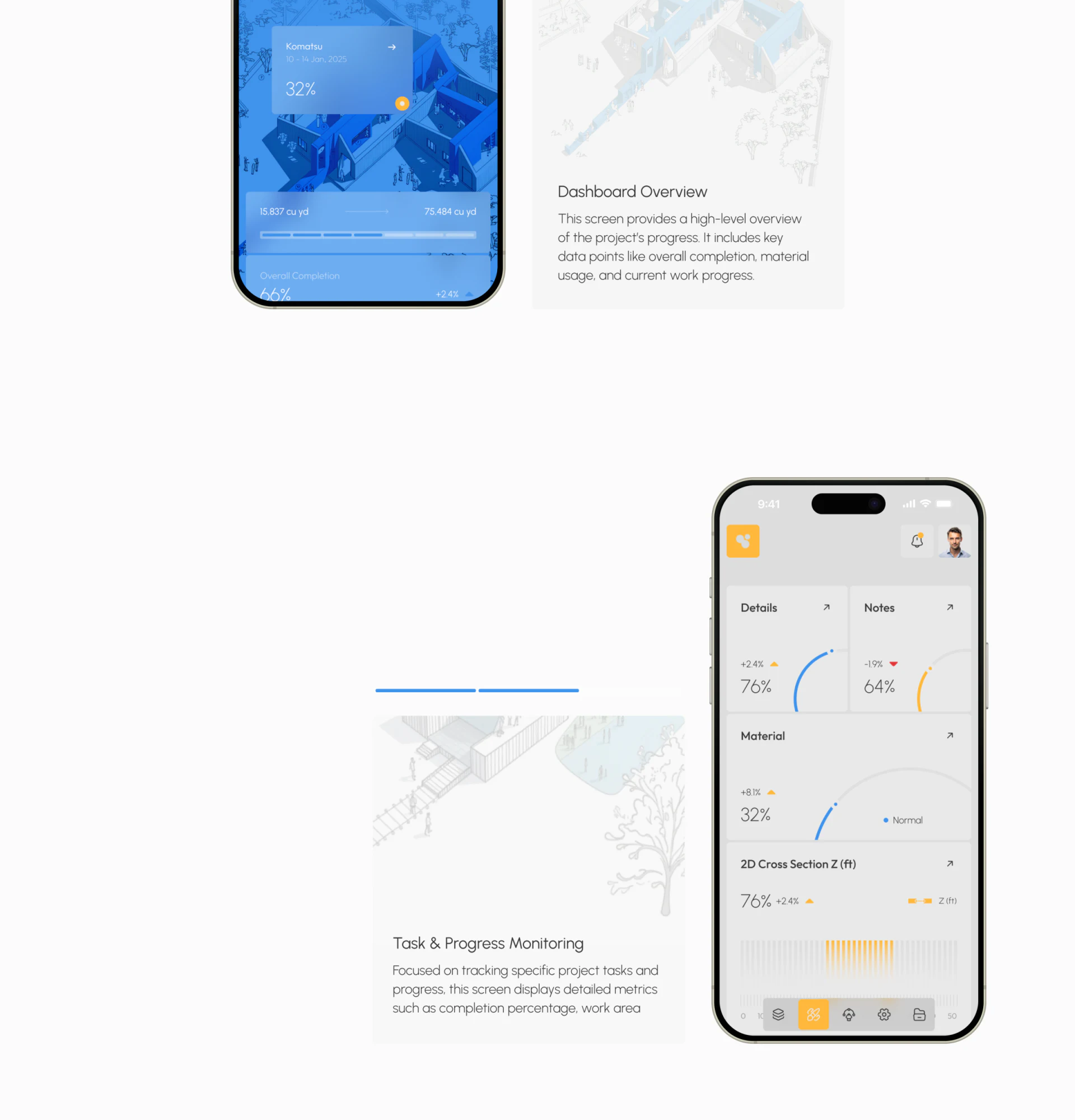
The phone does not compress the desktop into one miniature image. One screen shows the model and overlay; another pairs Details and Notes, gives Material a full row and continues into a cross-section. The rearrangement preserves relationships and space for wording.
Yellow marks the current bottom navigation icon, matching model emphasis. This maintains style and location cues. Short labels can clarify unfamiliar icons, and switching should be checked for retaining the selected work area.
Construction teams often discuss the same object across devices. Preserve project and location names before deciding how many cards to display. The model then has a practical purpose: turning “this spot” into data that can be found.
Make business data readable alongside its work objects
Engineering, facility or field-management software combining models, charts and records can first clarify shared object information. JVDS Design Studio provides UI/UX design, website design and development, planning desktop and mobile interfaces around business processes.
 Link copied