Aura’s music app player design gives atmosphere and actions different scales. A full player lets a portrait fill the screen, an expanded panel groups buttons together, and a compact bar retains only the artwork, song name, and a few actions. The division of work across these sizes is the most useful detail to examine.
Key takeaways
- Aura gives its large portrait cover and centered play button distinct positions, keeping actions easy to find amid rich imagery.
- The mini bar retains song identity while the expanded panel offers more actions; the two sizes serve different amounts of page space.
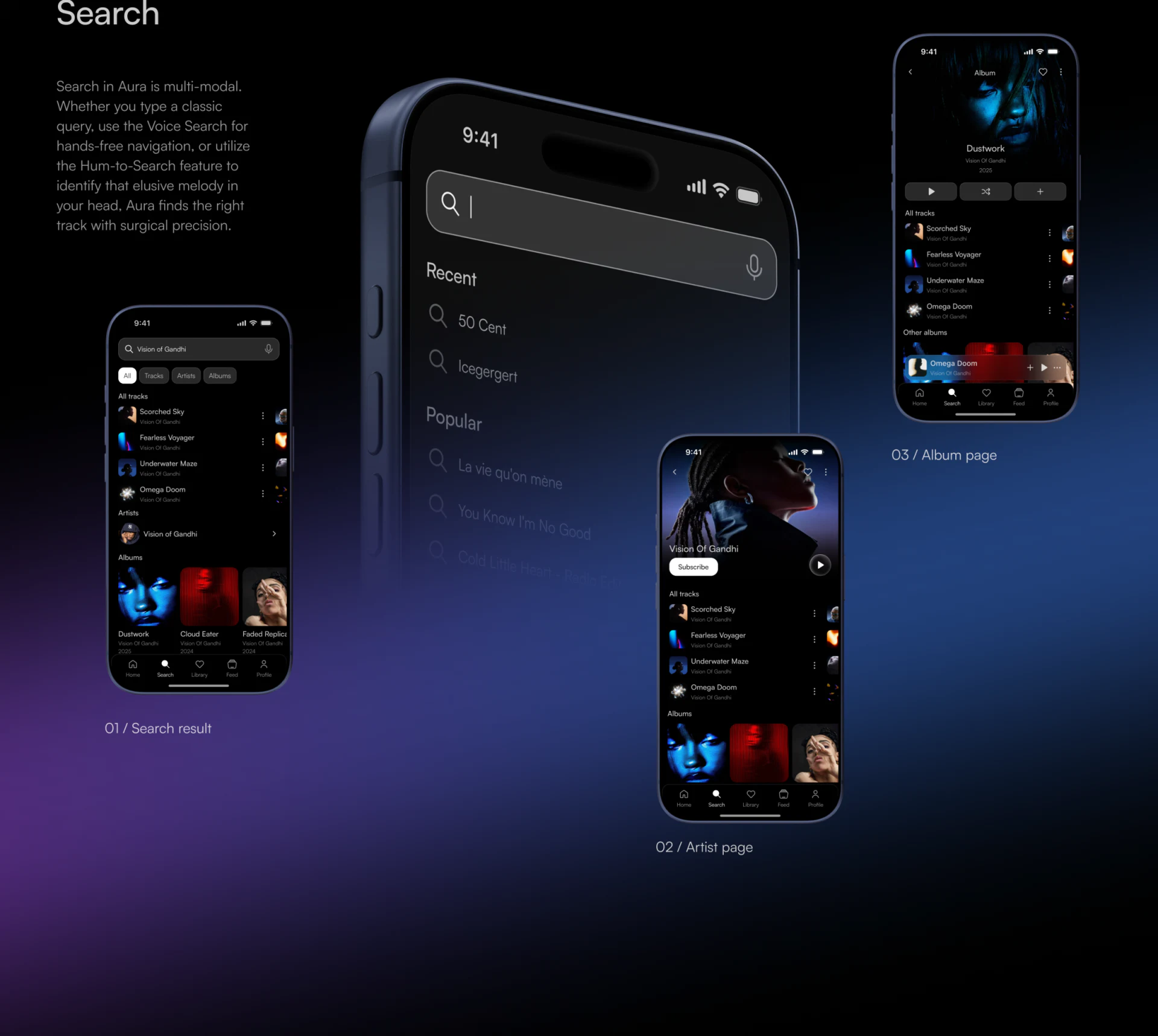
- Search results distinguish track rows, artist groups, and album covers, helping readers recognize what they will open.
An expressive photograph can still leave room for actions
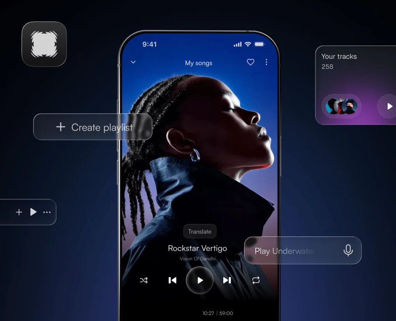
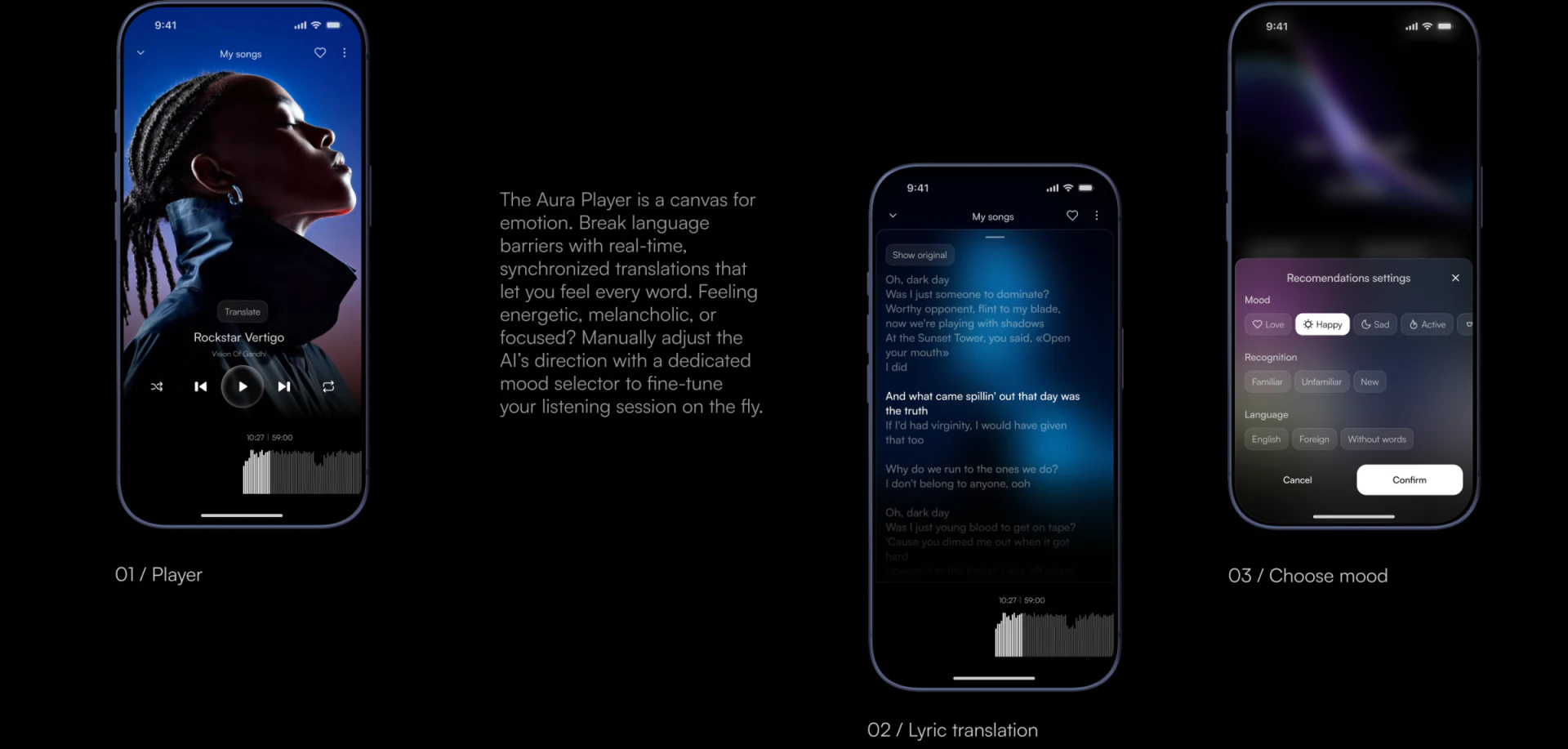
In the full player, a face in profile points toward the upper right, with blue extending from the head to the shoulders. Song and artist text sit over the darker chest area, and the play button is centered below, with previous, next, and other icons on either side. The photograph is strongly present, yet the route to reading the title and finding play is short.
This separation of the photographic subject and controls works well. The face is brightest and naturally attracts attention; text sits over dark clothing, and the button has its own circular outline. JVDS finds it more useful to ask exactly which part of an image sits behind the text than merely whether the background feels immersive.
The adjacent lyrics page uses a blurred blue background. A few lines in the middle are much brighter, while others recede. Each view has its own focus, and both retain time and a waveform below. The clear visual switch is worth borrowing; translation accuracy and actual lyric synchronization still require separate verification.
Expanded and compact controls each establish a focus
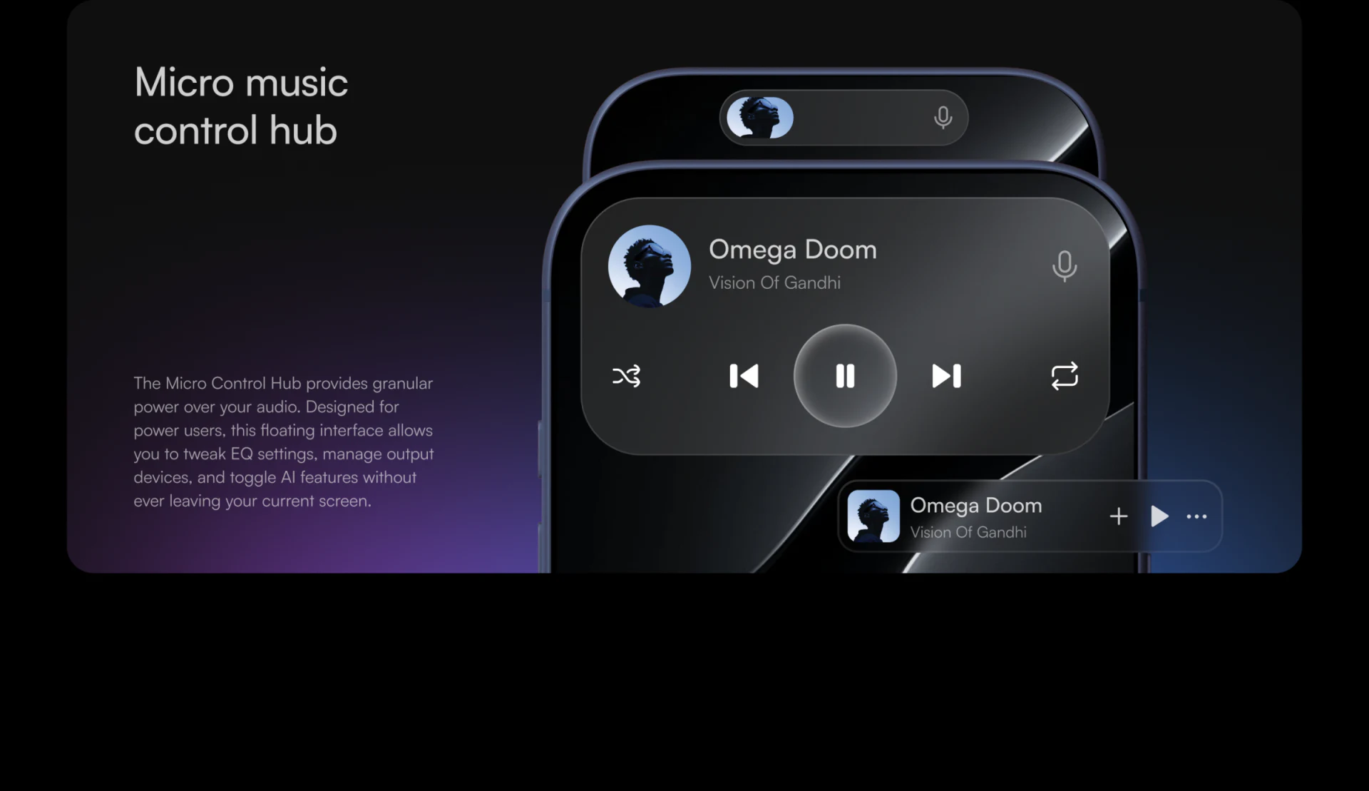
The expanded panel places circular artwork, song title, and artist in its upper half, followed by shuffle, previous, pause, next, and repeat icons. Pause is larger than its neighbors and clearly centered. Even with a glass-like finish, frequently read content and the most direct action are easy to locate.
The compact bar retains the song’s identity: artwork on the left, title and artist beside it, and plus, play, and more icons on the right. Here, mini player design is a choice about information; the expanded panel’s five controls are not simply squeezed into a smaller scale. The bar can therefore sit near other content without feeling like another full player.
The presentation also calls for careful handling of long titles. The bar already contains two text lines and several actions; at actual size, longer content will reveal what compresses first. Artwork helps identify the current item, while song text and actions each require space that cannot be surrendered arbitrarily.
Categories give the same name different destinations
A strength of the music search categories is that not every item becomes an identical row. All, Tracks, Artists, and Albums sit below the search field. A separate artist group follows the track list, and albums use larger covers. The layout alone helps indicate whether the reader is finding a song, a person, or an album.
Covers serve different purposes in these areas. Small square images support quick scanning of track rows, album covers provide a fuller visual identity, and artist pages use portraits to establish identity. All come from musical content but need not share one size. Names and object types should appear together so an attractive image does not obscure what it represents.
The album page at the upper right includes a useful detail: the current-song bar sits above navigation at the bottom, separate from the album’s own play action. Two objects appear together, yet their hierarchy remains understandable. An interaction review can follow these entries to check that browsing a new album does not cause an unexpected playback change.
A subtle preference panel has a clear confirmation action
The recommendation panel divides Mood, Recognition, and Language into three small groups. Happy stands out on white, and Confirm has a complete white button area below. Other choices are darker, so the two white areas separately explain what is selected and how to confirm it. This reads more clearly than making every tag a highlighted button.
We are more interested in what the preference will affect: the current queue, this listening session, or all future recommendations? The screenshot does not say. Adding a short scope statement near confirmation would give the already clear visual choice a more explicit expected result.
Frequently asked questions
Should a music player use a full-screen photograph?
It suits pages emphasizing a person, album, or musical atmosphere, but the title and playback controls need clear positions. Aura places text over a dark part of the image; test readability with bright or complex covers as well.
Should a mini player retain every button?
Choose actions according to the browsing page’s needs. Song identity and direct playback actions usually deserve priority. More controls can sit in an expanded panel, but long titles and button spacing need checking at actual size.
Why distinguish tracks, artists, and albums in music search?
They may share a name but open different content and actions. Category tabs, group headings, and varied cover sizes can explain the object together, reducing the need to guess from its name alone.
Design review checklist
- Replace covers with bright, dark, and complex images to check titles and controls.
- Use long song and artist names at the bar’s actual size.
- Compare album playback with current-song actions and confirm their object hierarchy is clear.
- State the scope of recommendation preferences and check confirmation feedback.
Designing a music or audio product?
If your product includes a player, content discovery, album pages, or a supporting website, bring your current interfaces and content structure to the discussion. JVDS Design Studio offers UI/UX design, website design, and development services to help organize content hierarchy, workflows, and visual expression.
 Link copied