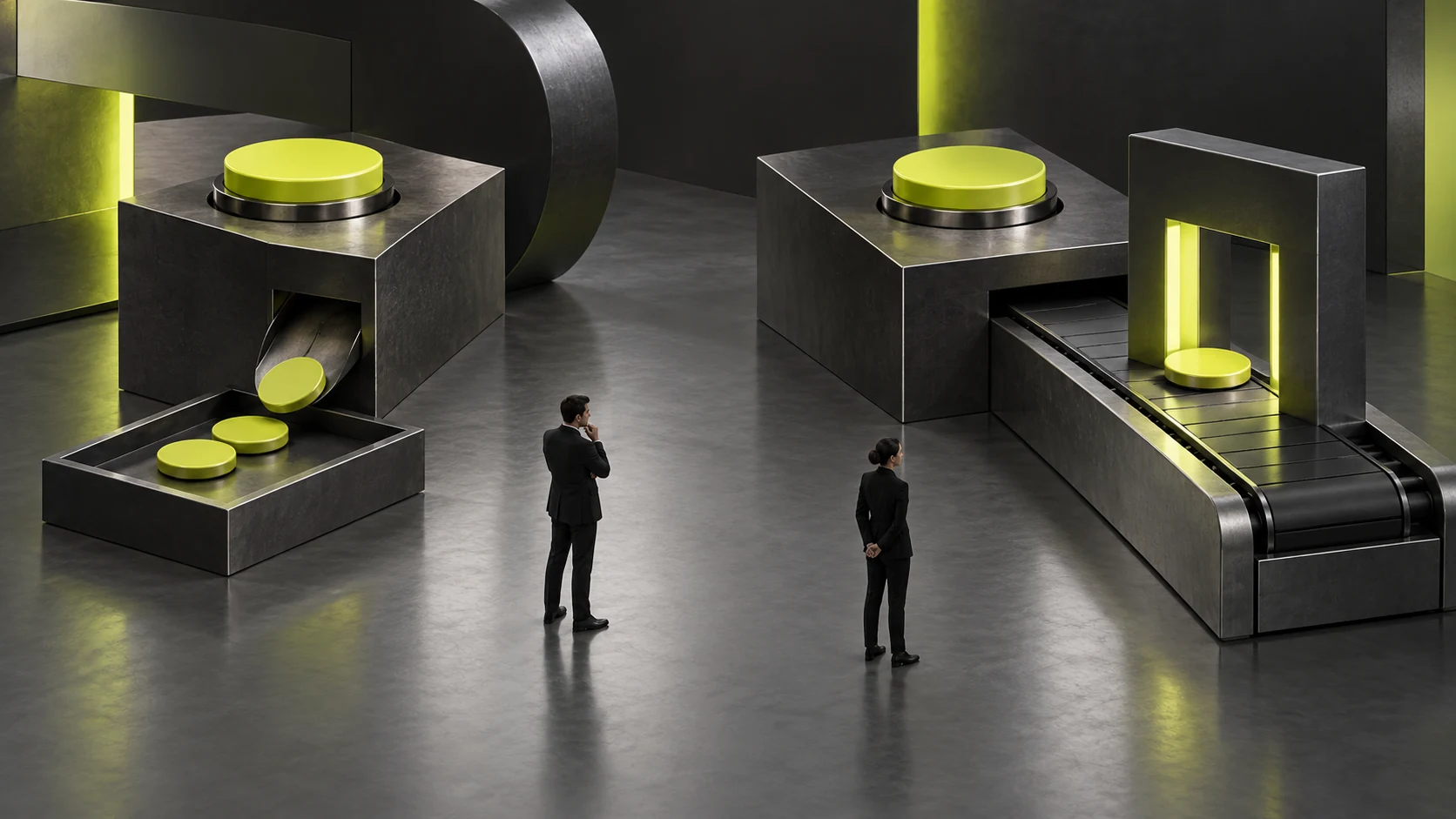
Two Almost Identical Buttons in a Design System: Should They Be Merged or Kept Separate?
When two design system buttons look almost identical, compare semantics, behavior, states and usage conditions before merging. Visual similarity does not prove shareability. Identical actions with historic styling differences may be unified, while different purposes and consequences need clear distinctions.
Start with Meaning, Not Color
Collect actual pages using both buttons and record actions, data or task effects and what users need to know. Queries, draft saving and final submission may need different feedback and conditions despite equal sizes.
Record names and explanations too. Different team names do not necessarily mean different components. Conversely, confirm may mean closing a notice or irreversibly submitting results. Component identity needs business semantics. See How to Plan a B2B Component Library for related checks.
Success means explainable common rules and differences, rather than screenshots looking similar as the sole merging reason.

Use a Four-part Comparison
Compare meaning, click behavior, states and environment. States cover actual enabled, disabled, loading and error conditions; environments may include dense tool areas, task endings or special devices. Do not invent scenarios to fill a checklist.
Separate business-justified differences from unexplained ones. The former may need variants or independent rules; the latter may come from old versions, manual styling or missed handovers. Record reasoning and approvers.
When discussing UI/UX standards with JVDS Design Studio, use actual samples and comparisons as inputs. Design systems, component code and governance support follow scope; visual guidelines do not automatically include every implementation.
Test Expressiveness after Merging
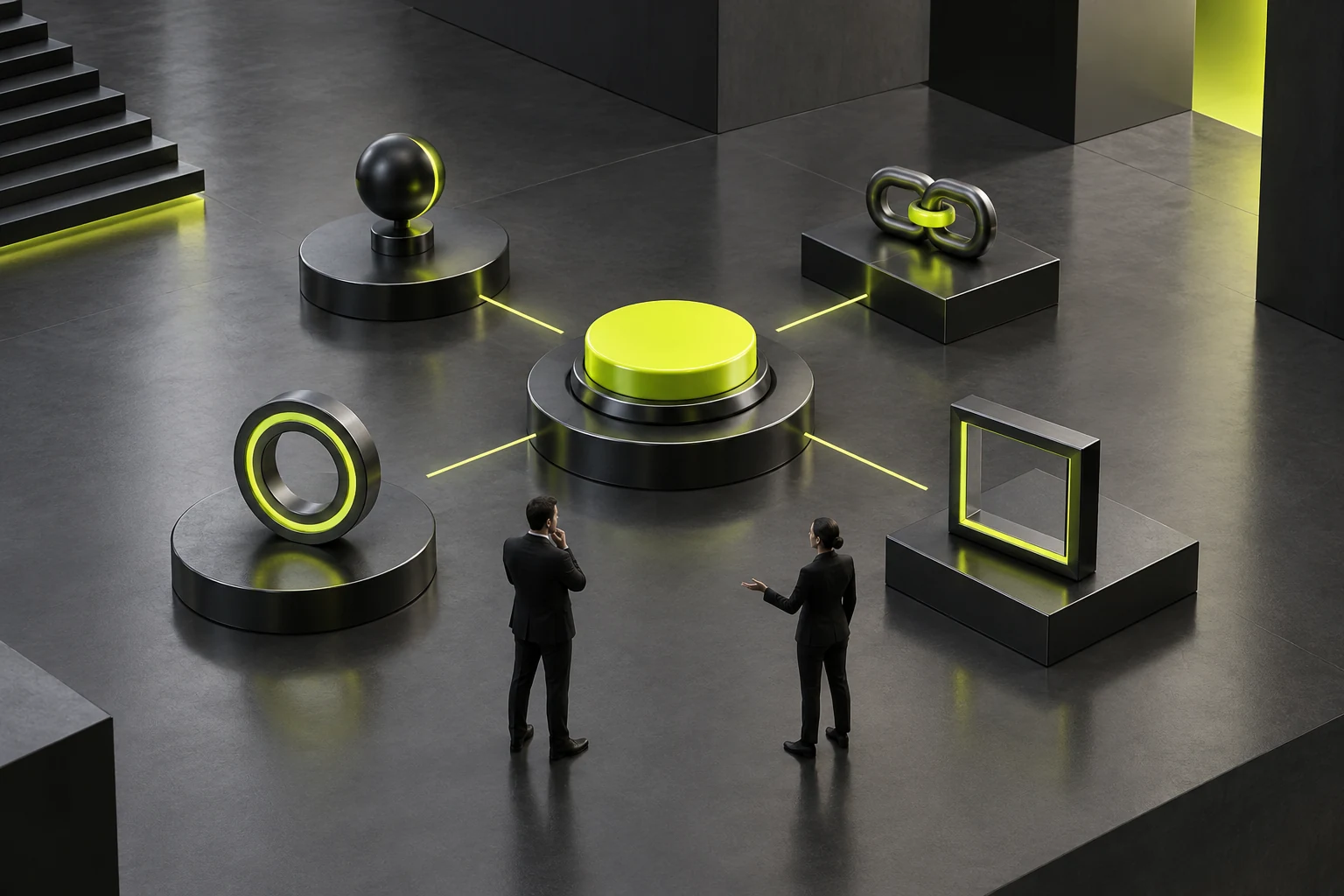
Before merging, confirm shared components express necessary existing states and behavior. Merged layer names with separate page rules hide divergence. Too many unexplained switches may also make configuration unclear.
If two save actions retain drafts but one needs another confirmation, assess whether this is an explainable state or an independent flow. Merging must not silently change business steps or remove necessary prompts for reuse.
Try the merged proposal on representative pages and check text length, feedback, disabled reasons and layout. Success means original tasks still work and users and developers know which configuration to choose without remembering historic page exceptions.
Separate Components Still Need Selection Rules
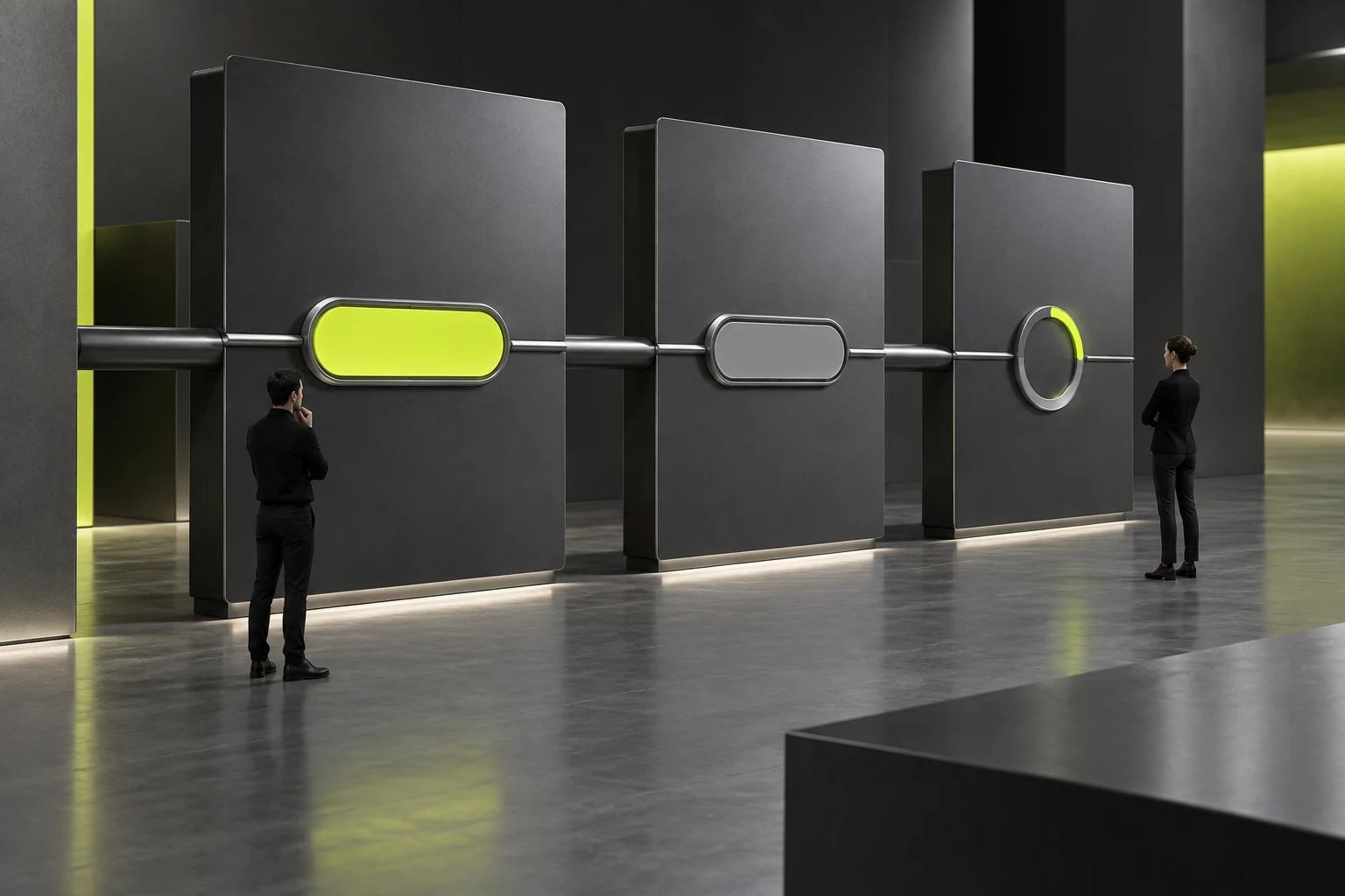
If merging is inappropriate, write distinct conditions and examples, including when not to use each. Names should help choices, not merely button one, button two or creation dates.
Record migration or retention for current pages without rebuilding every interface at once. Significant changes need behavior compatibility and resource checks. Explain differences between design files and code rather than claiming total system unification.
Success means successors can use rules for the same decision rather than copying another button. Systems gain value from explainable choices and maintenance; fewer components may result but are not a standalone success measure. See Will the design system limit creativity? The real problem is not that the components are too uniform, but that the system is designed too rigidly for related checks.
Frequently Asked Questions
Do Different Colors Require Separate Components?
Not necessarily. Equal meaning and behavior may allow variants according to actual use; colors indicating important task differences need explanation. Assess states and conditions alongside appearance.
Does Extensive Use Make Two Components Unsuitable for Merging?
Wide use calls for clearer impact checks, not an automatic prohibition. Confirm rules and migration targets and test representative pages. If resources are insufficient, define selection first and record future merging conditions.
 Link copied