Insights and Perspectives from a Head of Product Design
Nedbank Group is one of Africa's largest financial services organizations, primarily providing banking, insurance, asset management, and wealth management services. Nedbank Group has a 131-year history, total assets of ZAR 1 trillion, and more than 31,000 employees.
Developing an interactive design system in an enterprise environment presents many challenges. One of the greatest is the mindset of senior leaders and product stakeholders who lack a professional background in UI/UX design and have limited understanding of the details involved in development. You therefore need a strategic approach to achieving the goal. It is not enough to build a design system; you must continually assure senior management and stakeholders that the project is sustainable and will deliver greater profit and faster returns over the long term.
A design system is more than a few front-end components and a responsive asset library. It also needs lean documentation and a strong user experience to support decision-making and help the project succeed. Finding the right partners is another foundation for success. In an organization where design and development operate at scale, partners without the necessary systems expertise can put the product at risk.
Strong team spirit depends on independent thinking, initiative, and a willingness to accept some risk on behalf of the project. Not every decision is as easy as signing a document, and sometimes you may be told that certain steps are unnecessary. The idea that “it is easier to ask forgiveness than permission” begins to matter in your role as a problem solver.
How to Collaborate
When working on an existing pattern or feature, consult the team that has already done most of the work on that specific problem. Its experience will provide the deepest insights and experiments as a foundation for your research. You may think general best practices for a component eliminate the need to review what your company has already built. Some components, however, extend far beyond their basic use and require knowledge from the team.
Deep-work problems are often best solved independently or with a single expert. Opening them to a full team can easily disrupt the timeline and priorities and prevent progress on schedule. In my experience, pairing is the best way to solve a complex problem when the other person has mature skills and knowledge. When your own experience is not yet sufficient and you become stuck, you need a specialist to help move the work forward.
Gaining Company-Wide Recognition and Support
Finding the right direction in any enterprise system is difficult, but the essentials are to demonstrate value, keep promises, and deliver what you commit to. The design-system idea had been promoted a year before I joined the bank, but it remained an experiment and was not applied where it was needed. Many foundational details were missing: there was no standardized grid, no complete typography stack, and brand guidelines written for print had been applied to digital products without modification.
You need to earn trust through small wins. No matter how serious the situation is, do not begin by presenting every problem to the bank and then jumping directly to the most urgent one. Start with issues that have little financial impact but can deliver the greatest benefit. As a team, document every solution and then move gradually toward larger problems. Honestly, the work may not become easier; it often becomes harder before it improves. But the process builds stakeholder trust and gradually gives the team greater authority. Some issues are not worth fighting over. You cannot always do things in the way you or your team believes is best. Distinguish the decisions that are critical, those you can set aside now, and those that may change later. By giving stakeholders what they need today, you earn the opportunity to persuade them on important matters in the future. You will need every bit of influence you can gain.
“Be stubborn on vision, but flexible on details.” —Amazon CEO Jeff Bezos
Optimization
One major priority was identifying repetitive internal tasks, beginning with the manual updating of component images, documentation, icons, and similar assets. To make better use of the team's three front-end developers, we needed to free time for new architecture.
Static component images were replaced with actual developed components, eliminating the need to refresh outdated component views every week. Documentation now follows a Dropbox Paper workflow, with templates that clearly outline every component requirement. The team no longer needs weeks of meetings to debate why component documentation must repeat material already available on the web, or why annotated images should remain low fidelity so they require updates only when functionality changes.
Problems Encountered and Solutions Applied
1—Grid System
A recurring issue was that many UI designers did not use a grid system, while those who did often ignored alignment rules. Extensive grid work in certain projects also made the system harder to follow. I consulted every design lead in the company, placed their properties and values in a comparison table, and calculated the averages. This showed what the grid system should look like. Some teams were largely aligned on certain values, while others differed slightly. Team X used a 30 px gutter, which was close to our ideal. I asked whether other teams would be willing to adjust their gutters and offered priority support to those that needed help.
Make recommendations and accept feedback. Throughout communication with the team, keep its best interests in mind. Your job is to make the team's work easier.
2—Typography System
One team's typography guidelines showed little distinction from h1 through h6 and did not address hierarchy across the system. Because the team strongly preferred its existing type-weight ratios, we compromised. We documented its perceptions of the current typography and began adjusting hierarchy through color, using light and dark gray. The resulting typography solution preserved the team's priorities while repairing the information hierarchy.
On another occasion, I was asked to create responsive typography guidelines that scaled with each browser window. This required extensive calculation and visual judgment to achieve the best result. I strongly believed the solution should contain no more than four options, reducing both the design and development workload and the likelihood of future errors.
Simplifying complex issues between design and development prevents many future errors.
3—Spacing System
To make multiple component combinations clearer, design guidelines should provide spacing rules for each component. These include rules for using a component with text or paragraphs and guidance on which spacing values may be adjusted. In practice, however, documenting every case is nearly impossible. Even if every current rule were listed, new ones would continue to appear, and the spacing documentation would never be guaranteed to stay current.
The solution is actually simple: a spacing system can be reduced to two ideas—relationships and information hierarchy. Components placed closer together have a closer relationship and hierarchical connection, consistent with Gestalt principles.
4—Color System
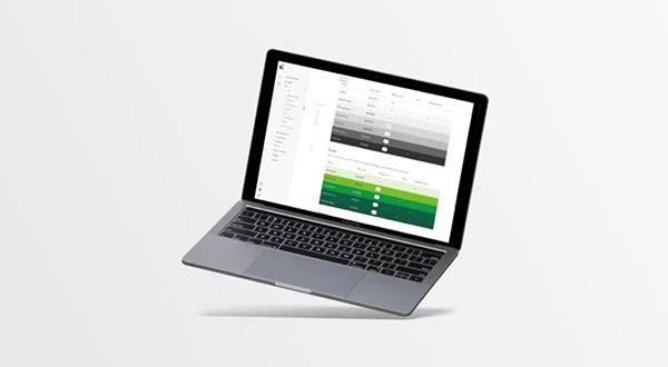
We retained many colors that Nedbank had used for years. The problem with the brand guidelines was that most colors had been selected for print and did not perform well on devices. We adopted two core brand colors, Nedbank Heritage Green and Nedbank Grass Green, and conducted accessibility testing. Grass Green was difficult to read in small, thin text, but the brand's existing gray could replace it. The gray also required adjustment. After gaining brand approval, we completed about three color iterations in the design system. The final result was a WCAG 2.0-level table indicating which colors could be used for print and backgrounds.
5—Component Documentation
Do not build a component system after reviewing only a handful of components. It is essential to understand at a system level how all components fit together. Document commonly used design rules so they can be applied consistently in similar contexts.
Much of a design system's value lies in its component documentation. Begin by establishing a template that creates consistency for recurring information, and invest time in a clear information hierarchy. Keep component documentation easy to read. Some documents take far too long to navigate because they are judged by the amount of content rather than its quality. Documentation should be scannable; users need to find relevant information quickly, not read an academic paper.
Long documents can be simplified quickly. If you spend a week on research and only 5% is useful, do not become attached to the rest. Delete it.
To reduce errors in collaboration, review the documentation carefully and ensure design partners have a deep understanding of the intended outcome.
6—Templates
Templates prevent designers from starting every interface from scratch. We begin with a base template containing grid combinations, global navigation, and a bottom tab bar. As the project evolves, templates for 404 pages, OTP, terms and conditions, and other needs are added.
7—Low-Fidelity Prototypes
A low-fidelity prototype is essential for explaining high-level functionality. Previously, every minor design change required annotated diagrams to be updated, wasting designers' time and forcing developers to recode pages. We created a basic low-fidelity UI kit—a lightweight, modular front-end framework—for building abstract components. This accelerated the process and made functional design clearer instead of keeping attention fixed on outdated design components.
8—Wireframe Templates
As with low-fidelity design, a design system needs a design language for wireframes. We had to explain many complex processes, and designers can make them more usable and engaging. Fortunately, the design team had a highly talented and capable user experience design leader, Jacques Louw. The team was very fortunate to have such a strong UX leader. His knowledge and research ability were crucial in persuading business teams and designers to trust our decisions. If user flows and diagrams had not been presented in a carefully designed format that designers could appreciate, most of the information would have been overlooked.
9—Asset Library
Banking products used many different icon libraries, including paid collections. Most libraries do not provide the financial icons a bank needs, so we worked with designers to create project-specific icons. We communicated through real-time screenshot feedback; when files could not be opened in the relevant design tools, screenshots were the simplest way to reach the desired result. We then drew each icon on a 16 × 16 grid with a 1 px stroke, keeping it legible when used alongside hyperlinks.
We ultimately produced a fully original library of more than 100 icons. Beyond the icon design, I created a simple naming convention and a development workflow with automatic export options for Web, iOS, and Android. Existing icons could be updated easily over the network. We then turned the icons into a font library, allowing any existing icon to be updated quickly and eliminating the inefficient process of changing them one by one in design and development.
10—Drawing Process
When drawing icons, strokes must align to the pixel grid so shapes can be combined easily into new visual effects and colored backgrounds. Designers also need to learn how to optimize and clean SVG icons and how to construct and think through animated icon effects.
11—Motion
Demand for animation has become increasingly clear. I had previously handled many animations with Airbnb's Lottie library, which works across Web, iOS, and Android and provides an excellent solution. I created a basic HTML container for a motion designer on the bank project and asked him to animate one of our illustrations with the Bodymovin plugin, then export and insert the JSON file. The result exceeded our creative director's expectations. We had found an end-to-end solution from graphics to animation and platform delivery.
12—Testing Template and Code Libraries
Do not wait for other teams to report problems. Every team member is responsible for using and testing the product. Would a chef send food to a guest without tasting it first? We found many issues and errors in our own work. Only by actively testing and reviewing it could we provide the bank with high-quality components and code.
13—Resource Center
We received many requests to place company information—from onboarding to business processes—inside the design system. These requests reflected limited understanding of why the product was being built. Information should remain relevant to the tasks of designers and developers rather than turning the platform into a dumping ground for every other document. As a designer or developer, it is important to keep information task-relevant instead of using the platform as a repository for unrelated materials. The solution was a dedicated Resource Center page containing outbound links to several Dropbox folders, where different departments could store relevant policies and documents. This avoided consuming design-system development resources while allowing other departments to update and add content freely within their dedicated spaces.
Conclusion
For teams building a design system or considering one, several important lessons stand out:
· Be strategic in how you achieve the goal.
· Bring the right people into the design system.
· Sometimes it is easier to ask forgiveness than permission.
· Collaborate when someone has already completed substantial foundational work.
· Pairing can solve complex problems when the partner has mature skills and knowledge; otherwise, working independently may be better.
· Give stakeholders what they need most now so you can earn the opportunity to present more important ideas later.
· Optimize not only your own workflow but the entire team's process.
· When multiple teams have designed the same thing, place every valuable solution in a table and identify a balanced approach.
· Keep solutions simple. Complex solutions create complex problems.
· You cannot build a design system one component at a time. You need a system-level view of how every building block fits together.
(A design system cannot be built around one component at a time; you need a complete view of how all components work together.)
· Documentation templates are essential.
· When design components are still immature, low-fidelity visuals offer the best value.
· Consolidate and create your own icons. A small investment of time can produce substantial returns.
· Teach illustrators how to optimize and clean SVG files.
· Use Airbnb's Lottie library to deliver complex animation across platforms.
Need design or website development services?
JVDS Design Studio is a professional design studio focused on digital product experiences and brand identity. We work with businesses in China and overseas that want to strengthen their brand image, improve user experience and grow their business, providing clear, usable UI/UX design, high-quality website design and development, app and mini-program development, and cohesive, distinctive brand identity design.
Working on a B2B system or an app? Share your current screens and key user tasks so we can discuss the design scope.
 Link copied